Accordion
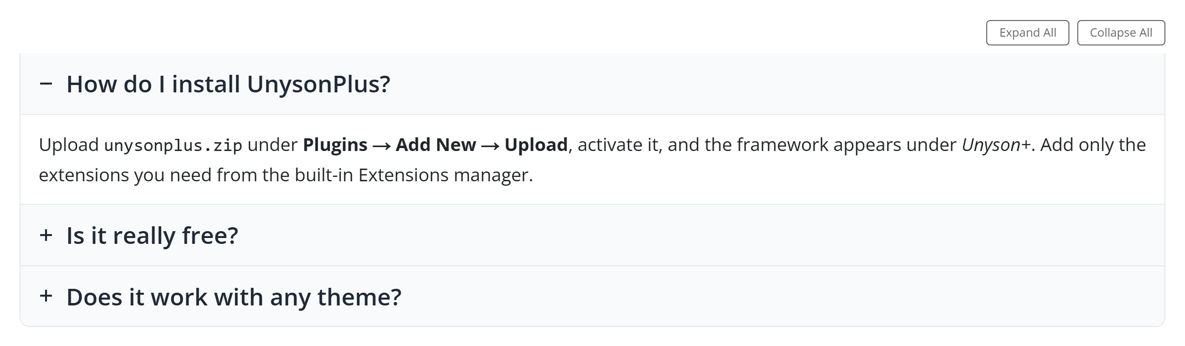
Collapsible panels — an FAQ, a spec sheet, a set of long answers. WordPress core ships a Details block for a single disclosure; the Unyson+ Accordion is the full version: multiple panels with icons, numbering, deep-links, an Expand / Collapse all control, and optional FAQ structured data.
Like every block in the library, it is a second authoring surface, not a second
renderer. The canvas preview and the front end are both produced by the
accordion element — the same PHP
that runs in the page builder — so what you configure in the editor is exactly what
ships.
Add it
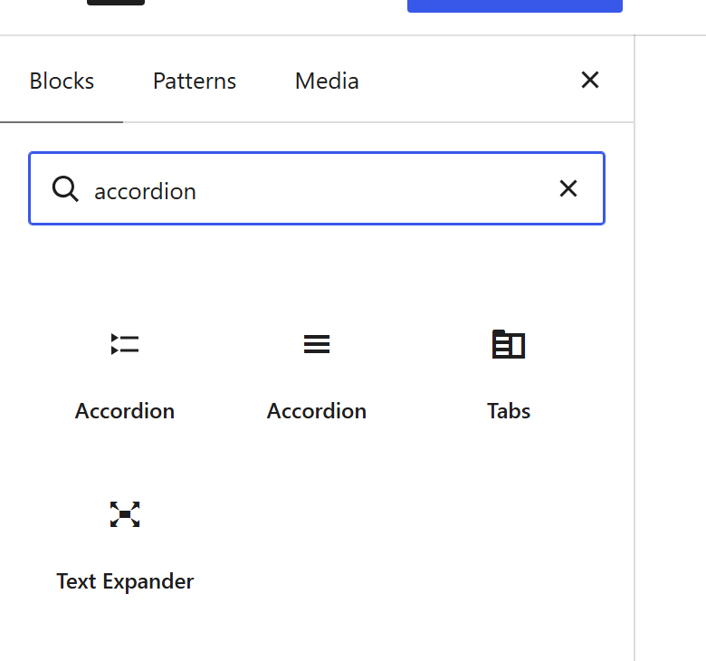
In the editor, open the block inserter (+), search “Accordion”, and choose the one under the Unyson+ category (described as “Collapsible panels with icons, numbering, deep links and FAQ schema”). It inserts empty — add your first panel in the block settings.
Configure it
Select the block and open the Settings (block) tab. The whole sidebar is generated from the element’s own option schema, so it stays in step with the page builder — there is no hand-written, block-only control that can drift.
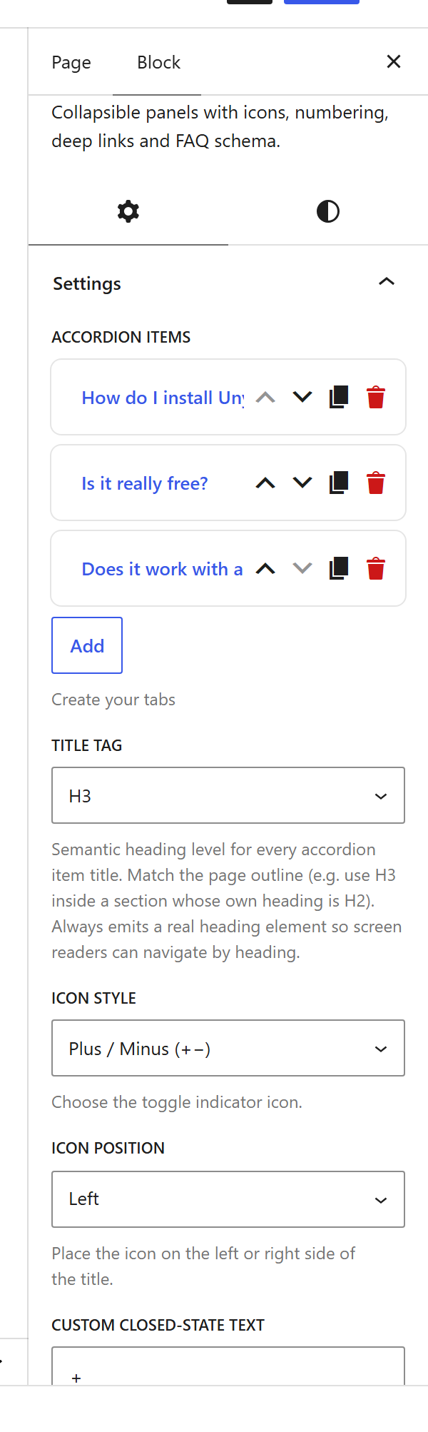
Start under Accordion Items: click Add to create a panel, give it a Title (the clickable header) and Content (rich text, images, other shortcodes), and optionally flip Open by Default to force that one item open. Drag to reorder.
Options
Content
| Option | What it does |
|---|---|
Accordion Items (tabs) | The panels. Each item has a Title, a rich-text Content body, and an Open by Default switch that overrides Initially Open for that single item. Empty by default — add at least one. |
Layout
| Option | What it does |
|---|---|
Title Tag (title_tag) | Heading level for every item title — H2–H6 (default H3). Match the page outline; a real heading is always emitted so screen readers can navigate by it. |
Icon Style (icon_style) | The open/closed indicator: Plus / Minus, Plus / X, Chevron, Arrow, No Icon, or Custom (text/emoji). Default Plus / Minus. |
Icon Position (icon_position) | Left or Right of the title. Right is the common FAQ pattern. |
Custom Closed / Open Text (icon_closed_text, icon_open_text) | The text or emoji indicator when Icon Style is Custom — e.g. + / −, ▶ / ▼, or 👇 / 👆. |
Item Numbering (numbering) | Prefix titles with a number/letter: 1, 2, 3, 01, 02, 03, a, b, c, A, B, C, i, ii, iii, I, II, III, Q1, Q2, Q3, or a Custom token pattern ({n}, {0n}, {a}/{A}, {i}/{I} — e.g. Step {n}:). |
Start Number (numbering_start) | The number the first item gets (default 1) — useful to continue a list split across two accordions. |
Item Spacing (item_spacing) | Vertical gap between items, from the theme spacing presets. |
Title Alignment (title_alignment) | Left, Center, or Right for the title row. The icon stays at its chosen position. |
Behaviour
| Option | What it does |
|---|---|
Initially Open (initially_open) | Which panels start expanded: First Item, None (all closed), or All Open. Default First. |
Collapsible (collapsible) | Allow all panels to be closed at once. Off = one item always stays open. |
Multiple Open (multiple_open) | Let several panels be open together. Off = opening one closes the rest (classic accordion). |
URL Hash Deep-Linking (hash_linking) | Open the panel whose ID matches the URL hash and update the hash on toggle, so a link like …/page/#accordion-…-panel-3 jumps straight to an answer. Default Yes. |
Expand / Collapse All (show_expand_collapse_all) | Add two buttons above the accordion that open or close every item at once. Most useful with Multiple Open on. |
FAQ Rich Snippet (faq_schema) | Emit FAQPage JSON-LD so search engines can show the accordion as an expandable FAQ result. Use on a genuine Q&A list, and only one accordion per page. |
Styling
| Option | What it does |
|---|---|
Accordion Style (accordion_style) | The visual language: Bordered (one rounded box), Separated (individual cards), Flush (hairline dividers), Filled (tinted title bars), Ghost (borderless with an accent underline). Default Bordered. |
Corner Radius (corner_radius) | None, Small, Medium, Large. |
Elevation (elevation) | Shadow depth — None, Subtle, Raised (most visible on Separated / Filled). |
Open-Item Accent (active_accent) | Accent colour for the open item — a full-width underline plus a soft tint on its title. |
Title Hover Feedback (title_hover) | Shade a title bar on hover so it reads as clickable. Default Yes. |
Font Size (font_size_preset) | A named size from the framework presets. |
Colours (tab_title_color, title_bg_color, tab_content_color, content_bg_color, icon_closed_color, icon_open_color) | Per-part colour pickers for the title text/background, content text/background, and the toggle icon in each state. |
WordPress block supports
Beyond the schema controls, the block opts into core features, so these come from
WordPress itself and inherit the site’s design system published to theme.json:
- Alignment — supports Wide and Full width.
- Dimensions — Margin and Padding via core’s Dimensions panel.
- Global Styles — colours, typography and spacing resolve to the theme’s presets.
Sample content
The demo above is three FAQ panels with the first open, the Expand / Collapse
controls on, and FAQ schema enabled. You normally build this in the Settings
sidebar, but a block is just markup — this is what it saves as (a single upOptions
object keyed by the same paths the page builder uses):
<!-- wp:unysonplus/accordion {"upOptions":{
"tabs":[
{"tab_title":"How do I install UnysonPlus?","tab_content":"<p>Upload <code>unysonplus.zip</code> under Plugins → Add New → Upload, activate it, and add the extensions you need.</p>","is_open":"yes"},
{"tab_title":"Is it really free?","tab_content":"<p>Yes — every extension is free, with no pro tier.</p>","is_open":"no"},
{"tab_title":"Does it work with any theme?","tab_content":"<p>The framework runs on any theme, and pairs with the UnysonPlus parent theme.</p>","is_open":"no"}
],
"faq_schema":"yes",
"show_expand_collapse_all":"yes"
}} /-->
A freshly inserted block stores only what you change (upOptions: {}); the element’s
declared defaults fill in the rest at render time.
Accessibility
The accordion follows the WAI-ARIA disclosure pattern: each title is a real button
inside the heading level you choose (title_tag), with aria-expanded kept in sync and
aria-controls pointing at its panel. Enter/Space toggle, and the
panel gets a matching id so deep-links and screen readers resolve to the right content.
Pick a title_tag that fits the page outline (don’t skip levels) and the accordion
stays navigable by heading.
Front-end markup
The element renders a wrapper whose classes encode every visual choice, so a theme can target any of them:
<div class="accordion ac-xxxx accordion-icon-plus-minus accordion-icon-left
            accordion-title-align-left accordion-style-bordered accordion-radius-md
            accordion-elev-none accordion-hover">
  <div class="accordion-controls">
    <button class="accordion-controls__btn accordion-controls__btn--expand">Expand All</button>
    <button class="accordion-controls__btn accordion-controls__btn--collapse">Collapse All</button>
  </div>
  <div class="accordion-item">
    <h3 class="accordion-title ui-state-active">
      <span class="accordion-icon">…</span>
      <span class="accordion-title-text">How do I install UnysonPlus?</span>
    </h3>
    <div class="accordion-content">…</div>
  </div>
  …
</div>
Relationship to the accordion element
The block and the page builder’s accordion element are two doors onto the same code. Anything documented for the element — its options, markup, and behaviour — is true here too; the block simply exposes those options as a generated inspector and previews the result live in the editor.