Motion Gallery
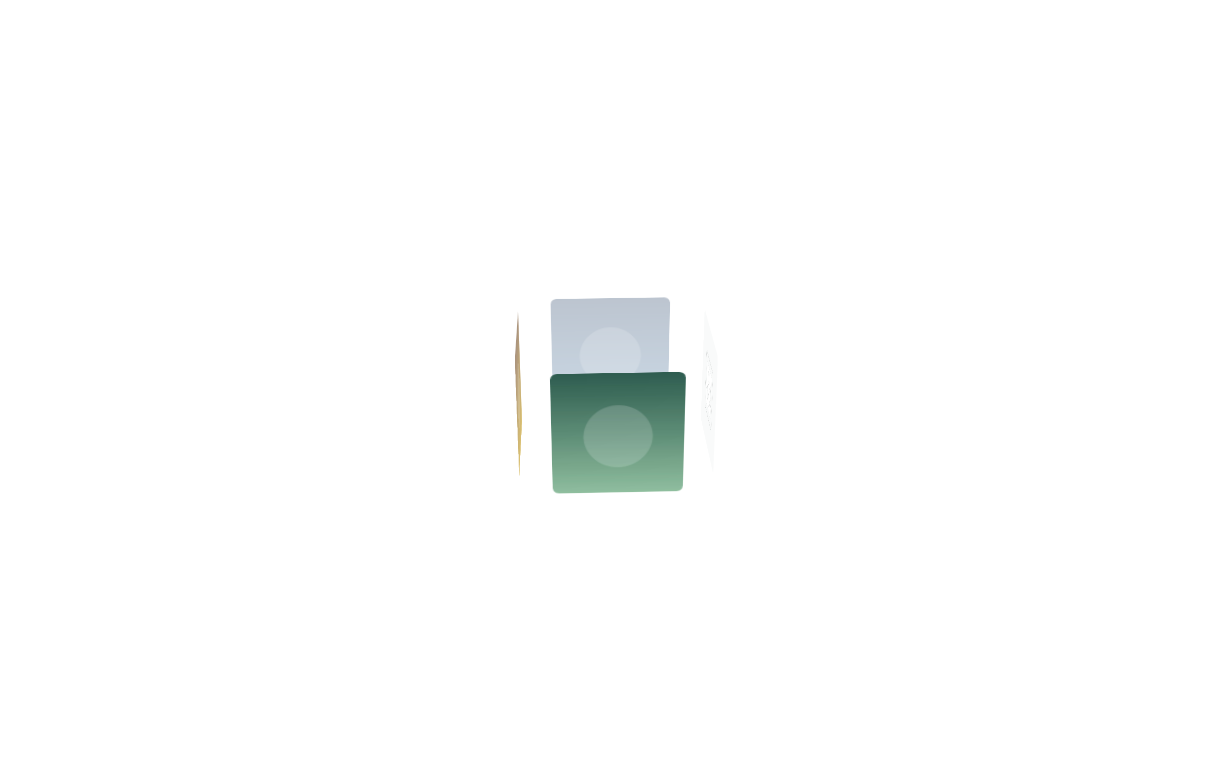
Images arranged on a rotating 3D ring — a coverflow-style carousel that turns in perspective as visitors drag or it auto-rotates. A showy way to present a small, curated set of photos. Like every block in the library, it is a second authoring surface, not a second renderer: the canvas preview and the front end are produced by the same server-side code as the page builder, so the output is identical either way.
Options
Select the block and open the Settings (block) tab; the whole sidebar is generated from the element's option schema, so it stays in step with the page builder.
| Option | What it does |
|---|---|
Source (source) | The images — pick from the Media Library, or pull featured images from a post type. |
Design (design_settings, box_style, shadow) | The ring/carousel layout, card style and shadow. |
Captions (captions, caption_source) | Whether to show captions, and where they come from (image caption, title, alt or description). |
On click (click, link_to_post) | Open a lightbox, follow a link, or link to the source post. |
Text (text_align, text_color, font_size_preset) | Caption alignment, colour and size. |
The block also opts into WordPress Margin / Padding (and, where it makes sense, alignment), which inherit the site's design system from theme.json.
Sample content
A block stores only what you change as one upOptions object; the element's declared defaults fill in the rest at render time. The demo above is:
<!-- wp:unysonplus/gallery-3d {"upOptions":{"source":{"kind":"media","media":{"images":[{...},{...}]}}}} /-->
The source images are media references ({"attachment_id":123,"url":"…"}), so build the set with the block's picker rather than typing it by hand.