Image Hotspots
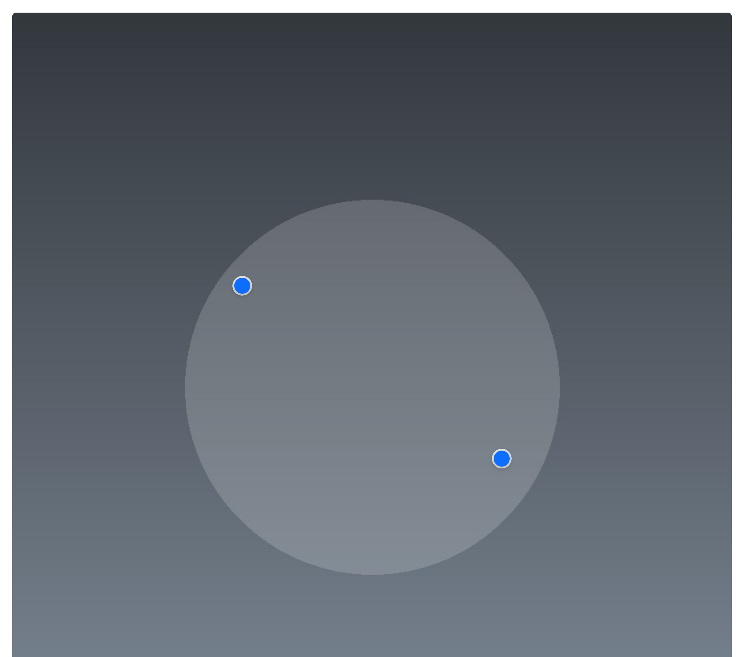
An image with interactive pins — each marker sits at a point on the picture and reveals a label or description on hover or click. Ideal for annotating a product, a floor plan or a diagram. Like every block in the library, it is a second authoring surface, not a second renderer: the canvas preview and the front end are both produced by the Image Hotspots element — the same server-side code as the page builder — so the output is identical either way.
Options
Select the block and open the Settings (block) tab; the whole sidebar is generated from the element's option schema, so it stays in step with the page builder.
| Option | What it does |
|---|---|
Image (image) | The picture the pins sit on. |
Hotspots (hotspots) | The pins. Each has an x / y position (as a percentage), an icon, and text (plus an optional link). |
Trigger (trigger, click) | Whether a pin's popup opens on hover or on click. |
Pin style (pin_color, pin_size, icon) | The look and size of the markers. |
Popup (pop_bg, pop_color, rounded) | The popup's colours and corners. |
Design (design, accent_color) + Font size (font_size_preset) | The overall style and type scale. |
The block also opts into WordPress Margin / Padding (and, where it makes sense, alignment), which inherit the site's design system from theme.json.
Sample content
A block stores only what you change as one upOptions object; the element's declared defaults fill in the rest at render time. The demo above is:
<!-- wp:unysonplus/image-hotspots {"upOptions":{"image":{...},"hotspots":[
  {"x":"32","y":"38","text":"A point of interest on the image."},
  {"x":"68","y":"62","text":"Another labelled detail."}
]}} /-->
The image value is a media reference ({"attachment_id":123,"url":"…"}), so use the block's image picker rather than typing it by hand, and drag the pins into place on the canvas.
The image-hotspots element
The block and the page builder's Image Hotspots element are two doors onto the same code. Its full option, markup and behaviour reference is documented there.