Newsletter
An email capture form with optional name field, consent text and success message. Like every block in the library, it is a second authoring surface, not a second renderer: the canvas preview and the front end are both produced by the newsletter element — the same server-side code as the page builder — so the output is identical either way.

Configure it
Select the block and open the Settings (block) tab. The whole sidebar is generated from the element’s option schema, so it stays in step with the page builder.
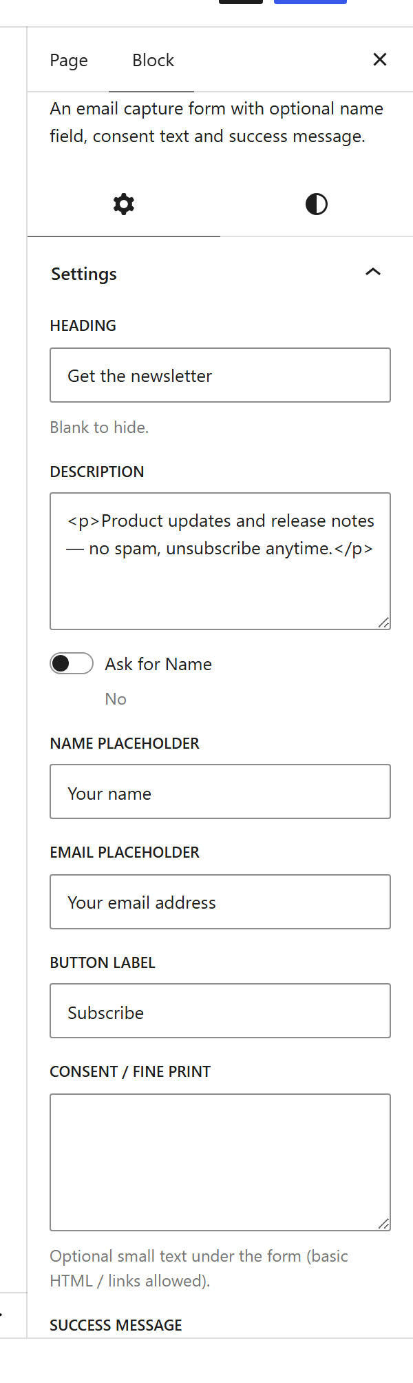
Options
| Option | What it does |
|---|---|
Title (title) + Description (description) | The heading and supporting line above the form. |
Name field (show_name, name_placeholder) | Optionally collect a name alongside the email. |
Email placeholder (email_placeholder) + Button (button_label) | The email field prompt and the submit button text. |
Consent (consent_text) | A GDPR-style consent line under the field. |
Messages (success_message, error_message) | What shows after a successful or failed sign-up. |
List (list_id) | The subscriber list the sign-up is stored in (see the Newsletter / Subscriber CRM extension). |
Design (design) + Alignment (align) + Rounded (rounded) + Colours | Inline or stacked layout, alignment, corner rounding and colours. |
The block also opts into WordPress Margin / Padding (and, where it makes sense, alignment), which inherit the site’s design system from theme.json.
Sample content
A block stores only what you change as one upOptions object; the element’s declared defaults fill in the rest at render time. The demo above is:
<!-- wp:unysonplus/newsletter {"upOptions":{"title":"Get the newsletter","description":"<p>Product updates and release notes — no spam.</p>","button_label":"Subscribe","align":"center"}} /-->
The newsletter element
The block and the page builder’s Newsletter element are two doors onto the same code. Its full option, markup and behaviour reference is documented there.