Progress
Progress bars or circles for skills, capacity and completion. Like every block in the library, it is a second authoring surface, not a second renderer: the canvas preview and the front end are both produced by the progress element — the same server-side code as the page builder — so the output is identical either way.

Configure it
Select the block and open the Settings (block) tab. The whole sidebar is generated from the element’s option schema, so it stays in step with the page builder.
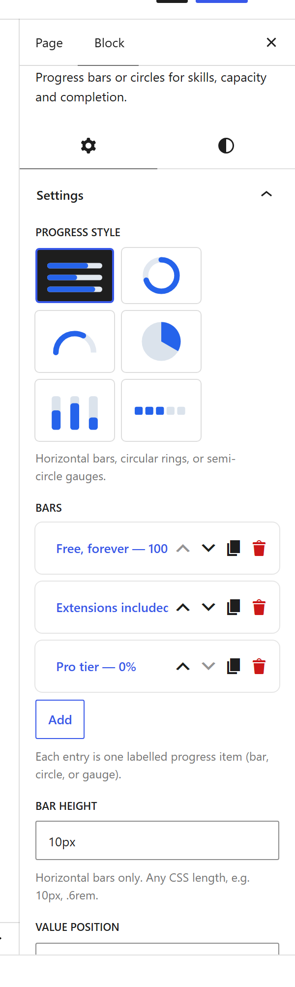
Options
| Option | What it does |
|---|---|
Bars (bars) | Each with a Label, a Percent (0–100), and an optional icon and colour. |
Layout (layout) | Horizontal bars or circular meters. |
Height (height) + Rounded (rounded) + Striped (striped) | Bar thickness and style. |
Value (show_value, value_position) | Whether the percentage shows, and where. |
Animate (animate) + Count up (count_up) | Fill and count the number up when it scrolls into view. |
Gap (gap) | Space between bars. |
Colours (fill_color, track_color, label_color) | Fill, track and label colours. |
The block also opts into WordPress Margin / Padding (and, where it makes sense, alignment), which inherit the site’s design system from theme.json.
Sample content
A block stores only what you change as one upOptions object; the element’s declared defaults fill in the rest at render time. The demo above is:
<!-- wp:unysonplus/progress {"upOptions":{"bars":[{"label":"Free, forever","percent":"100"},{"label":"Extensions included","percent":"100"},{"label":"Pro tier","percent":"0"}]}} /-->
The progress element
The block and the page builder’s Progress element are two doors onto the same code. Its full option, markup and behaviour reference is documented there.