Elementor
The widgets Elementor charges for, built in.
64 Unyson+ elements as native Elementor widgets — posts grids, forms, slides, countdowns, flip boxes, pricing tables and a full set of WooCommerce widgets — edited in Elementor's own side panel, with free Elementor.
The Elementor extension puts Unyson+ elements into Elementor's widget panel. They behave like any built-in Elementor widget: drag one onto the page, edit it in the side panel (Content, Style and Advanced tabs), and watch the preview update as you type. Undo, revisions, copy / paste and Elementor's global colours all work as usual.
Each widget is drawn by the same code as the matching Unyson+ page-builder element, so a testimonials slider looks and behaves the same whether you built the page in Elementor or in the Unyson+ Page Builder — and the element's designs, presets and colour palette from Theme Settings carry over.
Turning it on
- Make sure Elementor (the free plugin) is installed and active.
- Go to Unyson+ → Extensions. The Elementor extension is downloaded on demand rather than bundled, so click Show other extensions, then Install on the Elementor card, then Activate. It needs the Shortcodes extension, which is always on. Later updates arrive through the same Extensions page.
- For the shop widgets, also activate the WooCommerce extension (and the WooCommerce plugin). For the motion widgets, activate the Animation Engine extension.
Open any page in Elementor: the Unyson+ category is at the top of the widget panel, and Unyson+ Shop and Unyson+ Motion right below it when WooCommerce and the Animation Engine are on. Each widget carries the same icon as its Unyson+ page-builder element, so you can tell the two sets apart at a glance.
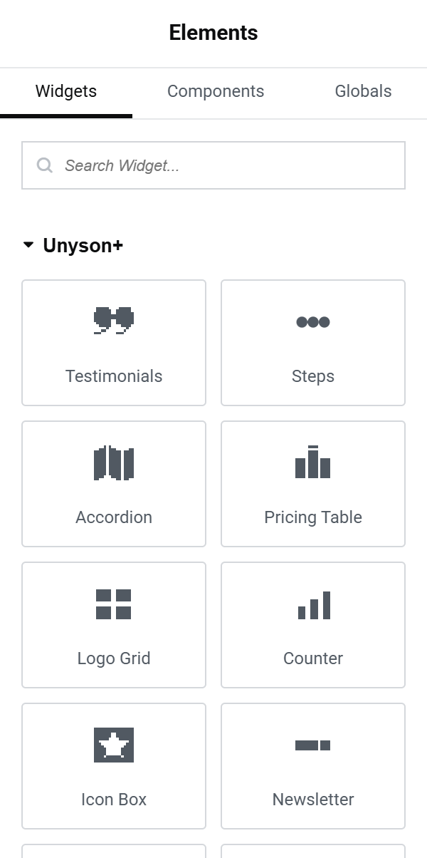
The widgets
Unyson+ (35)
| Widget | Use it for |
|---|---|
| Testimonials | Customer quotes — carousel, grid, marquee, masonry, spotlight and seven more designs. |
| Steps | A numbered process or "how it works". |
| Accordion | FAQs and collapsible sections, with optional FAQ rich-snippet schema. |
| Pricing Table | Plans with a monthly / yearly toggle and a featured plan. |
| Logo Grid | Client or partner logos — grid, boxed, carousel or scrolling marquee. |
| Counter | A number that counts up when it scrolls into view. |
| Icon Box | Feature or service cards with an icon. |
| Newsletter | An email signup form. |
| Gallery | Image galleries — grid, masonry, justified, carousel, slideshow, showcase and more, with a lightbox. |
| Tabs | Tabbed content in several styles. |
| Timeline | Milestones and history. |
| Progress | Skill bars, circles, gauges and pies. |
| Table | Data tables, with optional sorting, search and pagination for visitors. |
| Tag List | A row of labels / chips. |
| Badge | An announcement pill ("New — we just shipped v2.0"). |
| Feature List | Checklists and bullet lists with icons. |
| Posts | A grid, list or carousel of posts, with filters and pagination. |
| Flip Box | A card that flips or reveals its back on hover or click. |
| Call to Action | A banner with a title, message and button. |
| Countdown | A countdown to a date and time. |
| Share Buttons | Social share buttons. |
| Animated Headline | A heading with rotating, typed or highlighted words. |
| Blockquote | A styled quotation. |
| Slides | A full-width slider with image, heading, text and button per slide. |
| Hotspot | An image with clickable pins. |
| Lottie | A Lottie animation. |
| Table of Contents | An automatic table of contents of the page's headings. |
| Video Popup | A poster image that plays a video in a lightbox. |
| Modal Popup | A button, link, icon or image that opens a dialog. |
| Team Member | A person's photo, name, role and bio. |
| Comparison Table | Plans or products compared feature by feature. |
| Before / After | Two images with a draggable divider. |
| Star Rating | A star rating with optional review schema. |
| Image Box | An image card with title, text, icon and button. |
| Form | A contact form — see Forms below. |
Unyson+ Shop (18, with WooCommerce)
| Widget | Use it for |
|---|---|
| Products | Any product query as a grid or carousel. |
| Product Card | One chosen product as a card. |
| Product Categories | A grid of category cards. |
| Add to Cart | An add-to-cart button for one product. |
| Menu Cart | A cart icon with a count, opening a dropdown or side drawer. |
| Cart Link / Account Link | Header links to the cart and the visitor's account. |
| Product Search | A search box for products. |
| Product Filters | Price, rating and attribute filters — place it in the shop / category page template. |
| Upsells, Wishlist, Compare | Related products and the visitor's saved and compared products. |
| Product Page | A whole single-product layout for a chosen product. |
| Cart, Checkout, My Account, Order Tracking, Free Shipping Bar | WooCommerce's own pages and blocks, styled by Unyson+. |
Unyson+ Motion (11, with the Animation Engine)
| Widget | Use it for |
|---|---|
| WebGL Object | A live 3D shader object (blob, sphere, waves…) that reacts to the pointer and scroll. |
| SVG Draw / SVG Morph | An SVG that draws its strokes, or a shape that morphs through other shapes. |
| Motion Gallery | 3D galleries — carousel ring, panorama wall, card sphere, orbit, scatter, device cycler. |
| Parallax Scene | Depth layers that move with scroll or the pointer. |
| Image Scroll Choreography / Text Scroll Choreography | Images or text that travel across the screen as the page scrolls. |
| Interactive Reveal | Stacked layers revealed by drag, hover, scroll or time. |
| Image Sequence | A frame-by-frame sequence played by scroll. |
| 3D Model | A GLB / glTF model with camera controls, AR and hotspots. |
| Rive | An interactive Rive animation. |
Editing a widget
Click a widget to open its settings in the side panel. Content settings are on the Content tab, presets and colours on Style, and Elementor's own spacing, motion effects, responsive visibility and CSS classes on Advanced.
Where the page builder shows a picture to choose from — a testimonials design, a rating symbol — the side panel shows the same thumbnails. Options that only apply to one design appear only when that design is picked.
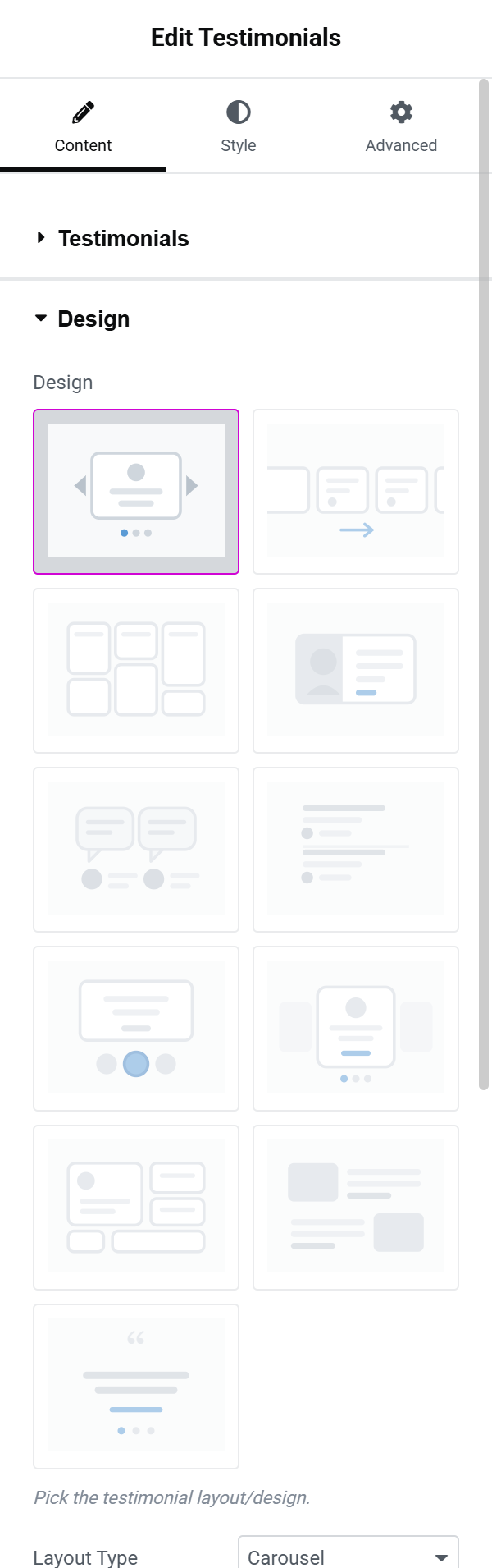
Colours offer your Theme Settings palette first (a preset dropdown) and a custom colour picker — which includes Elementor's global colours — second.
What you edit elsewhere
A few settings have no equivalent in Elementor's panel. They are kept and still take effect; you change them in the Unyson+ Page Builder:
- Lists inside a list item — a testimonial's Extra Texts rows.
- A form field's validation rules, help text and conditional logic.
- Table cells in pricing mode (amount, button) and merged cells.
- Typography groups on Counter and Countdown, a gallery grid's custom column split.
Forms
The Form widget starts as a ready contact form (name, email, message, consent). Each field has a type, label, required switch, placeholder, choices (one per line, for dropdowns, radios and checkboxes) and width. Submissions are stored under Unyson+ → Form Entries and emailed to the address in After Submit → Email to (your site's admin email by default). Sending email needs the Mailer set up (Unyson+ → Extensions → Mailer settings); until then the form shows "Invalid send method" above itself after a submission.
Hiding Elementor's locked Pro widgets
Free Elementor lists the widgets of its paid version as locked tiles. Since the Unyson+ categories cover most of them, the extension hides those locked tiles, the locked Atomic Form category and the "Upgrade" banners. To show them again, switch Hide locked Pro widgets off under Unyson+ → Extensions → Elementor. With Elementor Pro installed the setting does nothing — Pro's widgets show as usual, next to the Unyson+ ones.

Troubleshooting
- A widget shows a hint instead of content in the editor — it has nothing to show yet: a Lottie animation without a file, Upsells on a page that isn't a product, Product Filters outside the shop. The hint says what it needs; visitors never see it.
- No Unyson+ category in the panel — the extension is inactive, or Elementor isn't.
- No Unyson+ Shop category — activate the WooCommerce extension.
- A slider or accordion doesn't move in the editor — reload the editor; the scripts restart on every change, but a page opened before the extension was activated may need it.
For developers
Each widget is a short declaration on top of the element's shortcode: which options appear in
which panel section. The extension turns those options into Elementor controls and the saved
values back into the shortcode's attributes, so the shortcode's own view renders the widget.
Widget names are up-<shortcode tag> (for example up-testimonials) and are stable.
fw_ext( 'elementor' )->widget_for_shortcode( $tag ) returns the widget name for a shortcode,
and FW_Elementor_Option_Bridge::settings_from_atts( $tag, $atts ) converts page-builder
attributes into widget settings — the Site Converter uses both to build Elementor pages. The
filter fw_ext_elementor_widgets adds or removes widgets.