Shopper tools
Six things a shop needs that WooCommerce leaves to plugins: a wishlist, compare, back-in-stock notifications, variation swatches, a sticky add-to-cart bar and a size guide. All of them are off by default and live under Unyson+ → WooCommerce → Shopper Tools.
Each is independent — turn on only what your shop needs, and the front-end assets load only when at least one of them is on.
Wishlist
Lets visitors save products with a heart button, and see the saved list on a page of your choosing.
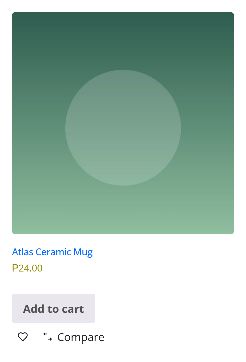
The heart appears on shop archive cards, on Products grids (via the Card Rows "Wishlist Heart" slot) and on single products, beside the add-to-cart:

Where the list is kept
| Visitor | Storage | Lifetime |
|---|---|---|
| Signed in | User meta (upwc_wishlist) | Permanent, follows them across devices |
| Guest | Cookie (upwc_wishlist) | 90 days |
When a guest signs in, whatever they collected merges into their account rather than being discarded — losing a wishlist at the login step is the moment a shopper is most likely to notice and mind.
Showing the list
Add the Wishlist element to a page, then put that page's URL in the Wishlist Page setting so the heart's "view your list" link and the header element know where to point. There is also:
- a Wishlist Link header/footer element (a heart with a live count), and
- a UnysonPlus — Wishlist widget for classic sidebars.
The Wishlist element renders each visitor's own list on the server, exactly like a cart page. If a whole-page cache serves it, one visitor sees another's saved products. Add it to your cache plugin's exclusion list along with Cart, Checkout and My Account.
The heart itself is safe to cache — every heart is rendered "off" and switched on in the browser.
Compare
A compare toggle on cards and single products, a bar along the bottom of the screen tracking the selection, and a table putting the picks side by side.

The Compare element renders the table: image, name, price, availability, rating, then every attribute any of the products declares — a product missing one gets a dash, so the columns stay aligned and the gap is visible rather than confusing.
| Setting | Purpose |
|---|---|
| Compare | The feature switch |
| Compare Page | URL of the page holding your Compare element — the bar's button goes here |
| Maximum Products | How many can be compared at once (2–6, default 4) |
Unlike the wishlist, compare is a session cookie for everyone, signed in or not: the question it answers ("which of these three?") stops mattering the moment it is answered, so there is no list to manage afterwards.
At the maximum, adding another is refused rather than silently dropping the oldest — the visitor chose those, and swapping one out behind their back is worse than saying no.
Back-in-stock notifications
An out-of-stock product is a dead end. With this on, the "Out of stock" line becomes an email field:
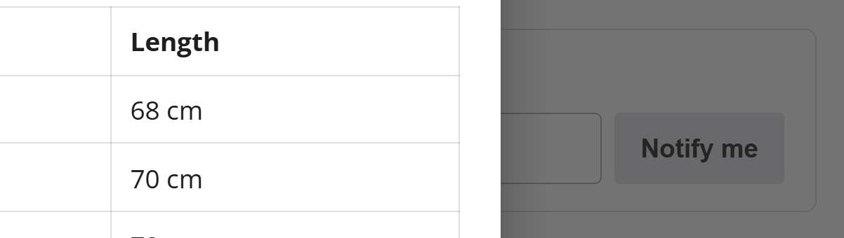
Everyone who signed up is emailed automatically the moment the product is restocked — and because it hooks the stock status rather than the product editor, that works however the restock happened: the editor, a CSV import, the REST API, or an order being refunded back into stock. A variation coming back into stock counts as the parent being back.
| Setting | Purpose |
|---|---|
| Back-in-Stock Notifications | The feature switch |
| Sign-up Heading | Shown above the email field |
| Notification Subject | Subject of the email. {product} is replaced with the name |
Sign-ups are stored as post meta on the product, so they are deleted with it and need no table of their own. A sign-up is for the next restock, not a standing subscription: the list is cleared when it sends. Each recipient gets their own message rather than sharing a BCC with strangers.
Customise the message with the upwc_bis_notification filter — see
For developers.
Variation swatches
Colour dots, image swatches or labelled buttons in place of the variation dropdowns:
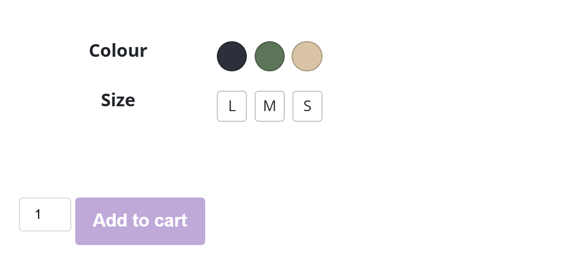
How each attribute is drawn is decided from the data, not from a settings screen you have to fill in:
| The attribute's terms carry… | Rendered as |
|---|---|
| A colour in term meta | Colour dots |
| An image in term meta | Image swatches |
| Neither | Labelled buttons ("S", "M", "42") |
The colour and image are read from the meta keys the common swatch plugins write, so a store
migrating from one of them keeps its swatches without re-entering anything. Add your own keys with
the upwc_swatch_color_meta_keys / upwc_swatch_image_meta_keys filters.
Past 15 options an attribute keeps its dropdown — a swatch grid of sixty is worse than the select
it replaced. Change the threshold with upwc_swatches_max_options.
The swatches drive WooCommerce's own hidden <select>: they set its value and dispatch a
change, so variation matching, price updates, gallery switching and add-to-cart all keep behaving
exactly as they do natively. The select stays in the accessibility tree, so keyboard and screen
reader users are not left behind.
Swatches on Product Cards puts the first swatchable attribute on shop and grid cards too; picking one opens the product with that variation already selected. Only the first attribute is shown — a card is a summary, and two rows of swatches on a grid tile is noise.
Sticky add-to-cart
On a long product page, the buy button is near the top and everything persuading you to press it is further down — so by the time someone is convinced, the control is gone. This slides a compact bar in once the real add-to-cart scrolls out of view:

| Setting | Purpose |
|---|---|
| Sticky Add to Cart Bar | The feature switch |
| Bar Position | Bottom (default) or top of the screen |
| Show Product Image | Include a thumbnail |
It never appears while the real button is still on screen, so the page never carries two of the same control. For a variable product the bar's button scrolls back to the form rather than pretending to add something before a variation has been chosen.
The bar is off in Catalog Mode — there is no button to be sticky about.
Size guide
A link beside the add-to-cart, opening your measurements in a modal:
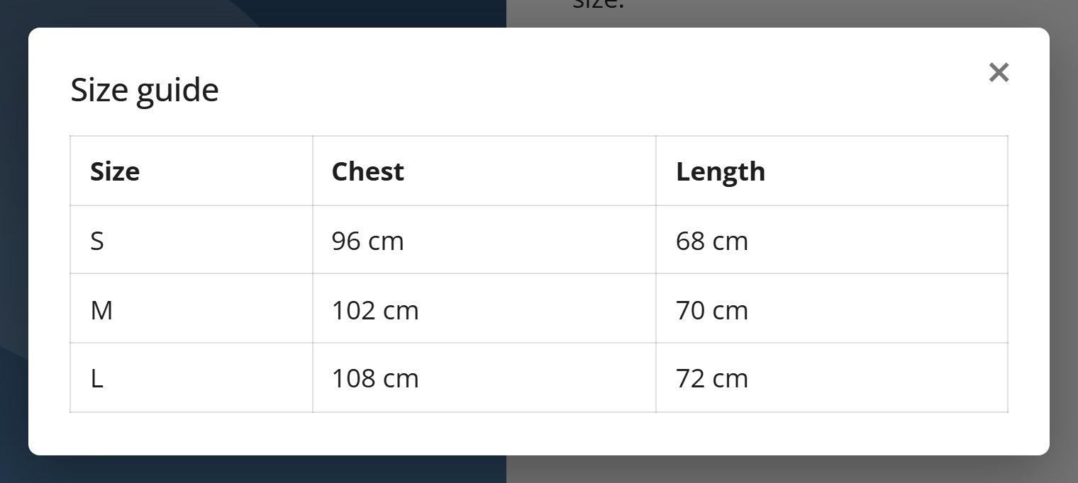
Content comes from the product first, the store default second: each product gets a Size Guide box on its edit screen, and anything without its own uses the Default Size Guide from the settings. A table works well.
If neither carries content the link is not rendered at all, so it can never open an empty modal.