Insert Section
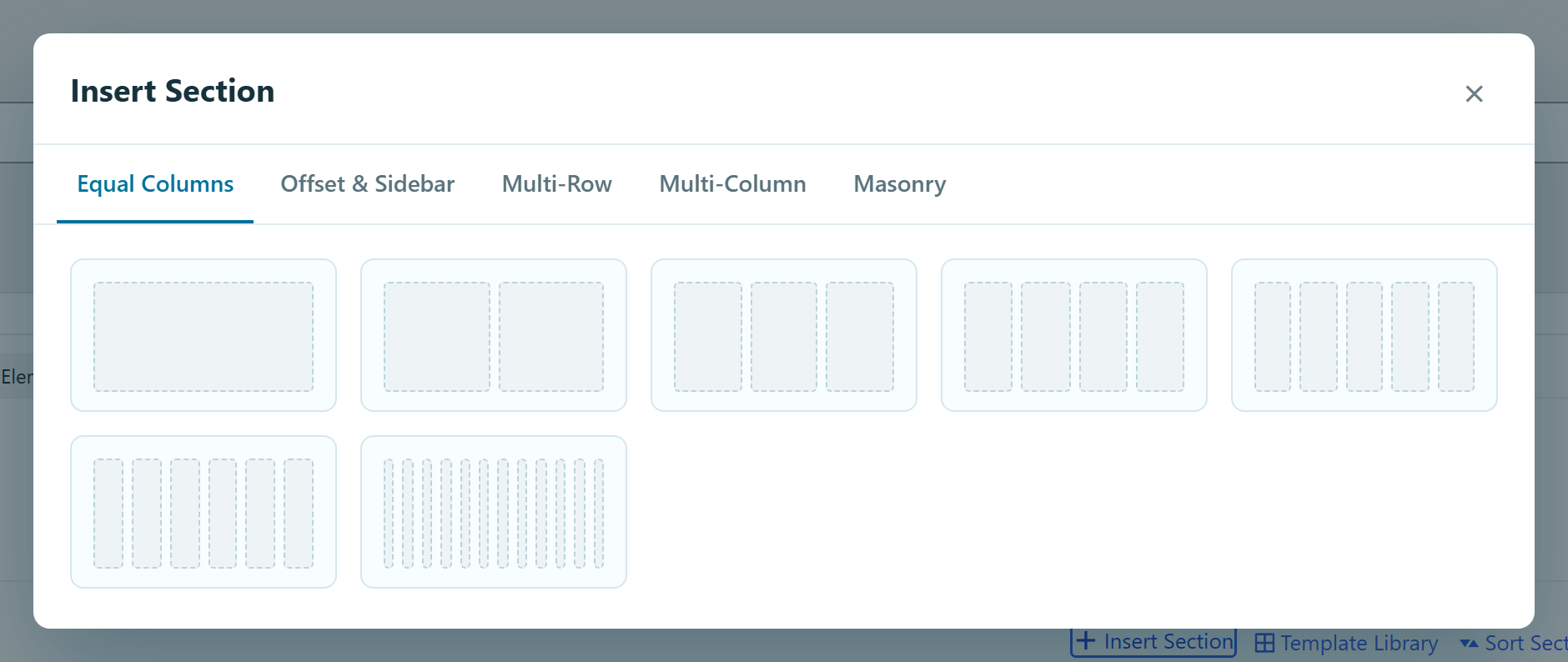
Insert Section is the fastest way to start a layout in the page builder. Instead of dragging in a container and then adding columns one by one, you pick a prebuilt layout from a gallery and the builder drops a ready-made, fully-formed layout onto the page — you just fill the columns with content.
The layouts it inserts are the modern Div — a Flexbox section of Flexbox columns — so the output is clean, semantic HTML, not the classic Bootstrap grid. (The one exception is the Masonry tab, which inserts a classic Masonry Section.)
You'll find the Insert Section link in the builder header toolbar (just before Templates). Click it to open the gallery.
Treat each section of a page the way you'd treat a paragraph in an essay — one clear topic, usually introduced by its own heading. Stacking unrelated content into a single band makes a page harder to scan for a visitor and harder to outline for a search engine, which reads your heading structure as a table of contents. Reaching for a fresh section (and heading) per idea keeps both readable. Google Search Central: Header tags
How it works
- Open a page in the builder (Unyson Builder) and click Insert Section in the header.
- Pick a category from the tabs across the top, then click the layout you want.
- A new Flexbox section, pre-filled with those columns, is appended to the end of the page.
- Drag your content elements into the columns, and reorder or resize the section as usual.
It uses the same insertion primitive as the Templates → Add From Library button, so an inserted layout behaves exactly like one you built by hand from Div tiles — nothing is locked or special.
Each layout is described as fractions of the row — 1/1 is full width, 1/2 a half, 1/3 a
third, and so on (plus the handy 1/5). On insert, each cell becomes a Flexbox (div) with that
Width — so afterwards you can change any column's width, per
breakpoint, from its options panel. See The Div element for the width
control, and Column widths & the grid for the fraction map.
Insert Section builds Flexbox rows. If you want a CSS Grid layout instead, the palette's Grid (div) tile opens its own grouped picker (equal / 2- / 3- / 4-column presets). Same idea, a Grid Div instead of a Flex one — see The Div element.
The categories
The tabs are the layout categories. Each one solves a different layout job.
Equal Columns
Sections split into evenly-sized columns — the everyday workhorse for feature rows, card grids and stat strips:
| Layout | Columns |
|---|---|
| 1 column | one full-width column (1/1) |
| 2 columns | two halves (1/2 · 1/2) |
| 3 columns | three thirds |
| 4 columns | four quarters |
| 5 columns | five fifths (the special 1/5, so five across need no CSS hacks) |
| 6 columns | six sixths |
| 12 columns | twelve 1/12 columns |
Offset & Sidebar
Unequal two- and three-column splits, plus sidebar layouts — for a main content area beside a narrower rail, or a full-width header/footer wrapping a content + sidebar row:
- Two-column offsets —
2/3 + 1/3,3/4 + 1/4,5/6 + 1/6,7/12 + 5/12,11/12 + 1/12, each available in both directions (wide-left or wide-right). - Three-column asymmetric — e.g.
1/2 · 1/4 · 1/4,1/6 · 2/3 · 1/6,1/2 · 1/3 · 1/6. - Sidebar blocks — a full-width row (header or footer) stacked with a content + sidebar row,
e.g.
1/1over3/4 · 1/4, or2/3 · 1/3over1/1.
Multi-Row
Sections that already contain several stacked rows, so a whole section of content comes in one click — for example a full-width intro row above a two- or three-up row, several equal rows, or a grid that steps from halves to thirds down the section.
Multi-Column
Nested "column-in-column" layouts — an outer column that itself holds its own sub-rows of
columns (one level of nesting). Useful when one side of the page needs its own internal grid,
e.g. a narrow 1/4 sidebar beside a 3/4 column that contains a two-up row over a full row.
:::note One level deep Multi-Column nests one level — a column can hold rows of columns, but those inner columns don't nest further. WordPress's shortcode parser is non-recursive for the same tag, which is why the builder keeps nesting shallow; see How the Page Builder works. :::
Masonry
Inserts a Masonry Section — mixed-width columns that flex-wrap into a staggered, Pinterest-style grid, filling gaps left-to-right in source order. Each thumbnail previews the exact stagger you'll get. This tab only appears when the Masonry Section element is available.
:::note The one Classic holdout
Masonry is the only Insert Section tab that still inserts a Classic container (the
masonry_section shortcode with classic columns). The other four tabs build modern Flexbox Divs.
:::
After you insert
An inserted section is a normal Div layout — so you can:
- Resize any column through its Width control (per breakpoint).
- Reorder or delete columns, or drag the whole section elsewhere on the page.
- Style the section — background, padding, direction, gap — through its options panel (see The Div element).
- Save it for reuse once you've built it out, via Snippets or a global template.
See also
- The Div element — the Flex / Grid / Block primitive these layouts are built from, and its responsive Width control.
- Column widths & the grid — the fraction map every layout uses.
- How the Page Builder works — how the layout tree is stored and rendered.