Flexbox (Div)
The Flexbox is the modern layout element — one container you set to Flex, Grid or Block, outputting a clean, semantic HTML tag. It's the primitive the builder now leads with, and it replaces the classic Section → Row → Column scaffolding with a single element that maps directly to how a developer writes a layout by hand.
In the palette's Layout Elements tab it appears as four tiles — all the same Flexbox element, pre-set for the job you're starting. Each has its own detailed page:
| Tile | Sets | Outputs | Use it for |
|---|---|---|---|
| Section | section tag · display: block | <section> | the full-width root band of a page — where you start (full-width band by default) |
| Block (div) | div tag · display: block | <div> | the simplest wrapper — grouping, spacing or a background around one thing |
| Flexbox (div) | div tag · display: flex | <div> | a one-dimensional row or stack that can wrap |
| Grid (div) | div tag · display: grid | <div> | a two-dimensional column layout (CSS Grid) |
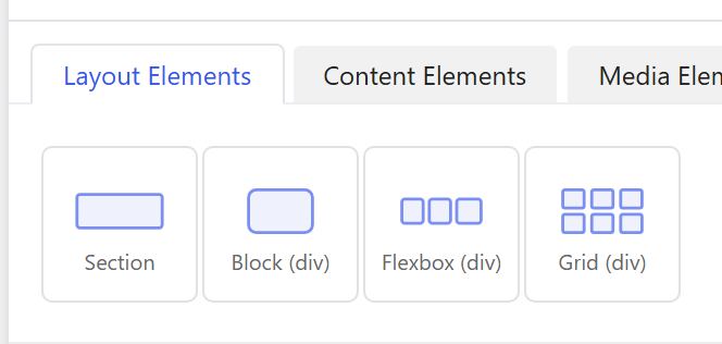
The tiles differ only in their starting HTML Tag and Display — you can change either on any of them, so a "Block" can become a Flex row and a "Grid" can become a Section. The builder just hides the options that don't apply to the current Display (Flex-only, Grid-only) and to the current tag (Section-only band styling).
For the concepts (Flex vs Grid vs Block), the responsive Width system and worked examples, see The Div element. This section is the per-tile option reference.
Options every tile shares
Beyond the per-tile Layout options (documented on each tile page), every Flexbox Div exposes the same container, child-placement, styling, animation and advanced options.
Container
| Option | What it does |
|---|---|
Content Width (content_width) | Constrain the box's content to a centred max-width — a named width from Theme Settings → Components → Container Widths (Narrow / Medium / Wide / …) or a Custom value. Inherit leaves it full width. |
Responsive Collapse (responsive_collapse) | On by default: a multi-column Grid/Flex row steps down on its own — 2 columns on tablets, one stacked column on phones — with no per-device setup. Turn off to keep the exact column count at every size. |
Child placement — how this box sits inside its parent
These control the box's own behaviour as a child of the Flex/Grid parent it lives in (set them on the child, not the container):
| Option | What it does |
|---|---|
Width Override (width) | The box's size inside its parent — a Flex width or a Grid span. Pick a fraction (1/2, 1/3, 2/3, fifths…) or Custom (px / % / rem / vw), per device. A blank (Auto) device inherits the next smaller one. |
Grow to Fill (flex_grow) | flex-grow — let the box expand to fill leftover space in a Flex row. |
Prevent Shrinking (no_shrink) | flex-shrink: 0 — stop a box shrinking (a fixed sidebar or logo beside a flexible area). |
Flex Basis (flex_basis) | The box's ideal starting size before it grows/shrinks — the flex: 1 1 300px card pattern. Flex parent only. |
Min Width (min_width) | Smallest the box may shrink to; forces it onto the next row when there's no room (clean card-grid wrapping). |
Align Self (align_self) | Override the parent's cross-axis Align for just this box. Flex parent only. |
Order (order) | Reorder the box among its siblings (First / Last / 1–12) without changing the markup. Flex parent only. |
Grid Column Start (col_start) | Place the box at an exact grid column (1–12) with no empty spacer cells. Grid parent only. |
Every child option is per-device (Phone / Tablet / Desktop tabs; a blank device inherits the smaller one).
Styling
| Option | What it does |
|---|---|
Background (background) | Colour, gradient, image and video layers (they stack: image over gradient over colour). Image "Fixed" gives parallax; video renders muted + looping with a poster fallback. |
Border / Box Style (border_preset) | A reusable box style — border, corners, shadow and an optional background fill with a hover state. Manage presets in Theme Settings → Styling → Borders. |
Backdrop Blur (Glass) (backdrop_blur) | Blur whatever shows through the box — the frosted-glass effect. |
Min Height (min_height) | A minimum height for the box. |
Aspect Ratio (aspect_ratio) | Lock the box to a width : height ratio. |
Blend Mode (blend_mode) | How the box composites with whatever sits behind it. |
Clip Shape (clip_shape) | Cut the box to a shape instead of a rectangle (any CSS clip-path). |
Edge Fade (edge_fade) | Dissolve the box into the background at its edges. |
Text Alignment (text_align) | Horizontal alignment of the text inside the box. |
Margin & Padding (spacing) | Outer margin and inner padding, from the spacing scale or custom. |
Sections add extra band-only styling — Background Pattern, Section Variant and Shape Dividers — documented on the Section page.
Animations & Advanced
- Animations tab — entrance and scroll animations (the shared Animation Engine settings).
- Advanced tab — CSS ID, CSS class, custom CSS, responsive visibility (hide per device) and dynamic-content display conditions.
Where it lives
The Flexbox leads the Layout Elements palette tab. The classic Bootstrap containers (Section, Container, Bleed Section, Masonry Section) and the column-width tiles now sit together in the Classic Layout tab.
The same primitive also powers the Theme Builder's Flexbox (scoped to header/body/footer parts) and the Flexbox block for the block editor — one engine, three surfaces.