Flexbox (Div)
The Flexbox tile is a Div pre-set to the div tag with display: flex — a
one-dimensional layout that lays its children in a row or a stack (column) and can
wrap onto new lines. It's the everyday tool for a row of cards, a header bar (logo + nav +
button), a media-beside-text pairing, or a button group.
Give each child a Width to
split the row (1/2 + 1/2, 2/3 + 1/3), or let them size to content and use Justify/Align to place
them.
Flexbox is built for a single row or a single column — it's the right tool for a nav bar, a card row, or a stack of form fields, but once you need items to line up in both rows and columns simultaneously, that's a two-dimensional job for Grid instead. Reverse Order is also worth a second look: it flips what visitors see without touching the underlying markup order, so make sure the reading order still makes sense for keyboard and screen-reader navigation, which follows the DOM, not the visual flip. MDN: Basic concepts of flexbox
Layout — the Flex options
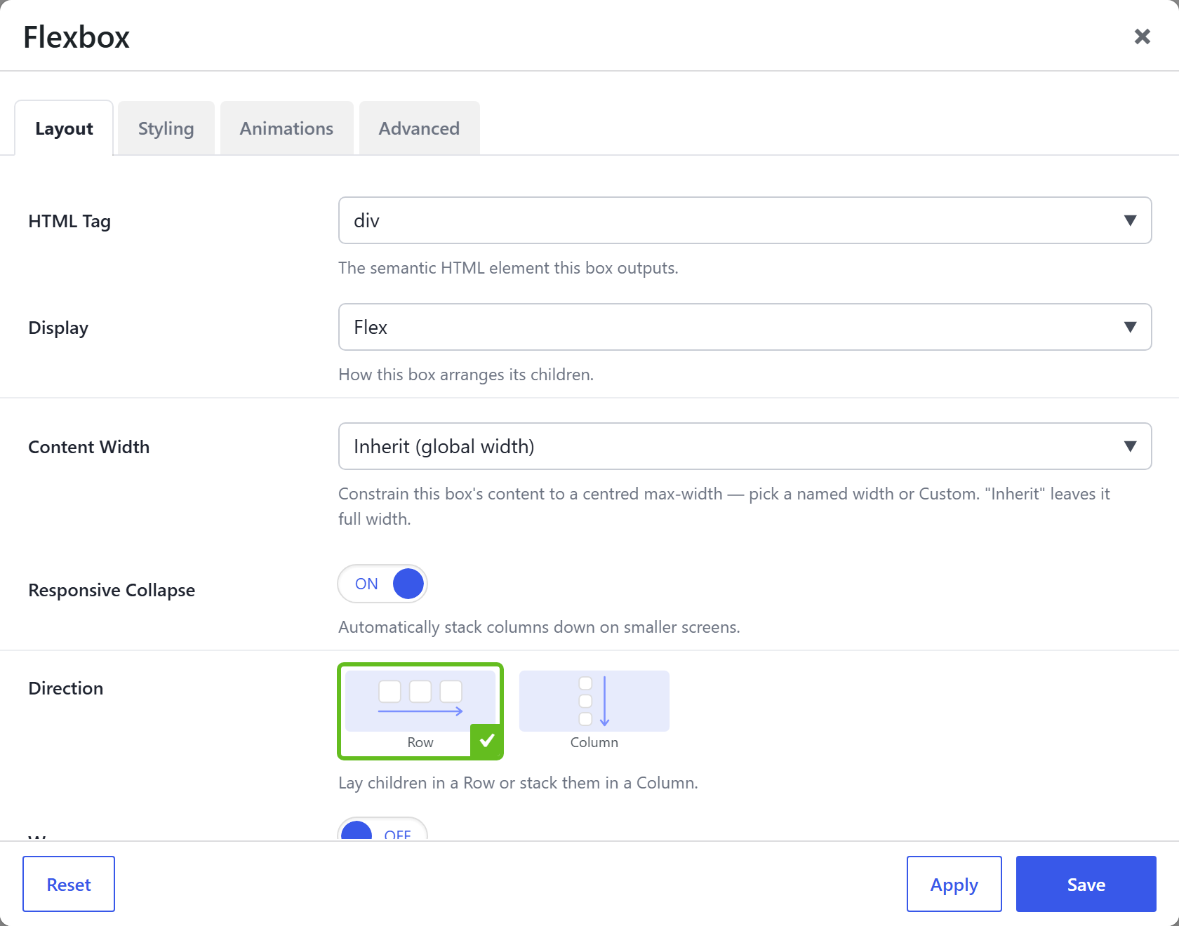
| Option | What it does |
|---|---|
HTML Tag (html_tag) | div for this tile (section / article / aside also available). |
Display (display) | Flex for this tile. |
Direction (direction) | Row (children side-by-side) or Column (stacked) — per device, e.g. a Row header that stacks to a Column on mobile. |
Wrap (wrap) | Let children wrap onto the next line when they run out of room (rows only) — per device. |
Reverse Order (reverse) | Reverse the visual order (row-reverse / column-reverse) without changing the markup — per device (e.g. image-above-text on phone, text-above-image on desktop). |
Gap (gap) | Spacing between children, from the spacing-scale presets. |
Row Gap (row_gap) | Vertical spacing between wrapped lines; overrides Gap on that axis. |
Column Gap (col_gap) | Horizontal spacing between items; overrides Gap on that axis. |
Justify (main axis) (justify_content) | Distribute children along the main axis — Start / Center / End / Space between / around / evenly. Per device. |
Align (cross axis) (align_items) | Align children on the cross axis — Start / Center / End / Stretch / Baseline. Per device. |
Align Content (wrapped lines) (align_content) | Pack the wrapped lines on the cross axis (only when Wrap is on and there are 2+ lines). Per device. |
Content Width (content_width) | Constrain the row's content to a centred max-width (named / custom); Inherit = full. |
Responsive Collapse (responsive_collapse) | On by default: a multi-column row steps down to 2-up on tablets and single-column on phones automatically. Turn off to keep the column count and tune Direction/Width per device by hand. |
Child placement (inside this Flex row)
The children you drop in are Divs too, and each carries the Flex child options — set these on the child, not the row (all per device):
- Width Override — the child's width (fraction or custom).
- Grow to Fill (
flex-grow), Prevent Shrinking (flex-shrink: 0), Flex Basis (ideal starting size — theflex: 1 1 300pxcard pattern), Min Width (forces clean wrapping). - Align Self — override the row's cross-axis Align for one child. Order — reorder a child (First / Last / 1–12).
Full descriptions on Flexbox (Div) → Child placement.
Also on every tile
Shared with all Div tiles (details on the overview): Background (color / gradient / image / video), Border / Box Style, Backdrop Blur, Min Height, Aspect Ratio, Blend Mode, Clip Shape, Edge Fade, Text Alignment, Margin & Padding, plus the Animations and Advanced tabs (CSS ID / class / custom CSS / visibility / dynamic content).