Grid (Div)
The Grid tile is a Div pre-set to the div tag with display: grid — a
two-dimensional column layout (CSS Grid). Reach for it when you want columns: an even card
grid, a features grid that reflows on its own, or a precise multi-column layout where items can span.
Two ways to define the columns:
- A fixed count — set Grid Columns to a number (e.g.
3), and children fill the tracks. - A spanning grid — set Grid Columns to
12, then each child uses its own Width as a track span (1/3= 4 tracks,2/3= 8), so1/3 + 2/3tiles exactly. Position items with Grid Column Start. - Auto-fit — let the grid fit as many equal columns as the width allows, with no breakpoints.
Where flexbox is one-dimensional, CSS Grid lays items out on both axes at once, which is what makes a feature grid or card layout that needs items to actually align in rows and columns straightforward instead of fought-for. Auto-fit is worth leaning on for a responsive grid — it reflows the column count to the available width with no manual breakpoints — but if you ever visually reorder grid items, remember the reading and tab order still follows the source order, so keep the two in sync for keyboard and screen-reader visitors. MDN: CSS Grid layout
Layout — the Grid options
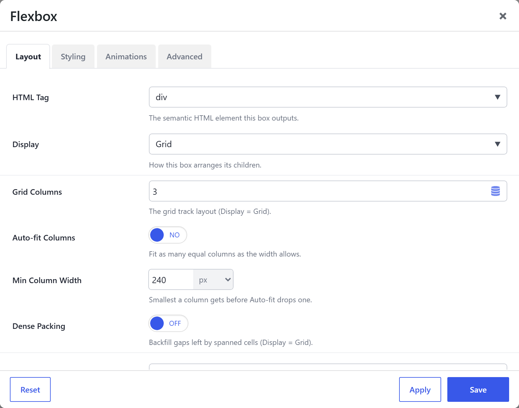
| Option | What it does |
|---|---|
HTML Tag (html_tag) | div for this tile (section / article / aside also available). |
Display (display) | Grid for this tile. |
Grid Columns (grid_columns) | The track layout: a number (e.g. 3 = three equal columns) or a raw grid-template-columns value (e.g. 2fr 1fr). Set 12 for a spanning grid where each child's Width becomes its track span. |
Auto-fit Columns (grid_autofit) | Ignore the count and fit as many equal columns as fit, each at least the Min Column Width, reflowing responsively with no breakpoints (repeat(auto-fit, minmax(…))). |
Min Column Width (grid_min) | With Auto-fit on, the smallest a column gets before one drops to the next row (the min in minmax). |
Dense Packing (grid_dense) | grid-auto-flow: dense — backfill gaps left by different-sized / spanned cells by pulling later items up (can reorder visually). |
Gap (gap) | Spacing between cells, from the spacing-scale presets. |
Row Gap (row_gap) / Column Gap (col_gap) | Per-axis spacing overrides. |
Justify (main axis) (justify_content) / Align (cross axis) (align_items) | Distribute and align the cells within their tracks. Per device. |
Align Content (align_content) | Pack the grid's rows on the block axis when there's extra height. |
Content Width (content_width) | Constrain the grid's content to a centred max-width (named / custom); Inherit = full. |
Responsive Collapse (responsive_collapse) | On by default: a fixed-count grid steps down to 2-up on tablets and single-column on phones automatically. (An Auto-fit grid already reflows on its own and is left alone.) |
Child placement (inside this Grid)
Each cell is a Div with these grid child options (set on the cell, per device):
- Width Override — becomes the cell's span when Grid Columns is
12(e.g.2/3= span 8). - Grid Column Start (
col_start) — place a cell at an exact column (1–12) with no empty spacer cells before it; Auto flows it into the next free cell. - Min Width, and (in a Flex context) Grow / Shrink / Align Self / Order.
Full descriptions on Flexbox (Div) → Child placement.
Also on every tile
Shared with all Div tiles (details on the overview): Background (color / gradient / image / video), Border / Box Style, Backdrop Blur, Min Height, Aspect Ratio, Blend Mode, Clip Shape, Edge Fade, Text Alignment, Margin & Padding, plus the Animations and Advanced tabs (CSS ID / class / custom CSS / visibility / dynamic content).