Section (Div)
The Section tile is a Flexbox Div pre-set to the section HTML tag — the full-width root
band of a page, where you start a layout. New Sections are a full-width band by default: the
background runs edge-to-edge while the content stays contained. Set its Display to Flex or Grid
to lay out the blocks inside it, or leave it Block and drop in other Divs.
Because it's the same Flexbox element, a Section carries every Div option; on top of the shared
set it unlocks the band-only controls below (revealed because the HTML Tag is section).
<section> is a landmark, not just a styling hookThe HTML <section> element tells assistive technology and search engines "here's a distinct, self-contained region of the page" — that's real semantic information a generic <div> doesn't carry, and it's what lets a screen reader user jump between the page's regions instead of reading it top to bottom as one blob. This tile defaults its HTML Tag to section for exactly that reason, so a page built from a stack of them ends up with a genuinely structured document, not just visually separated bands. MDN: the section element
Live demo
▶ See the Section live on the demos site — an interactive example you can click through.
Layout
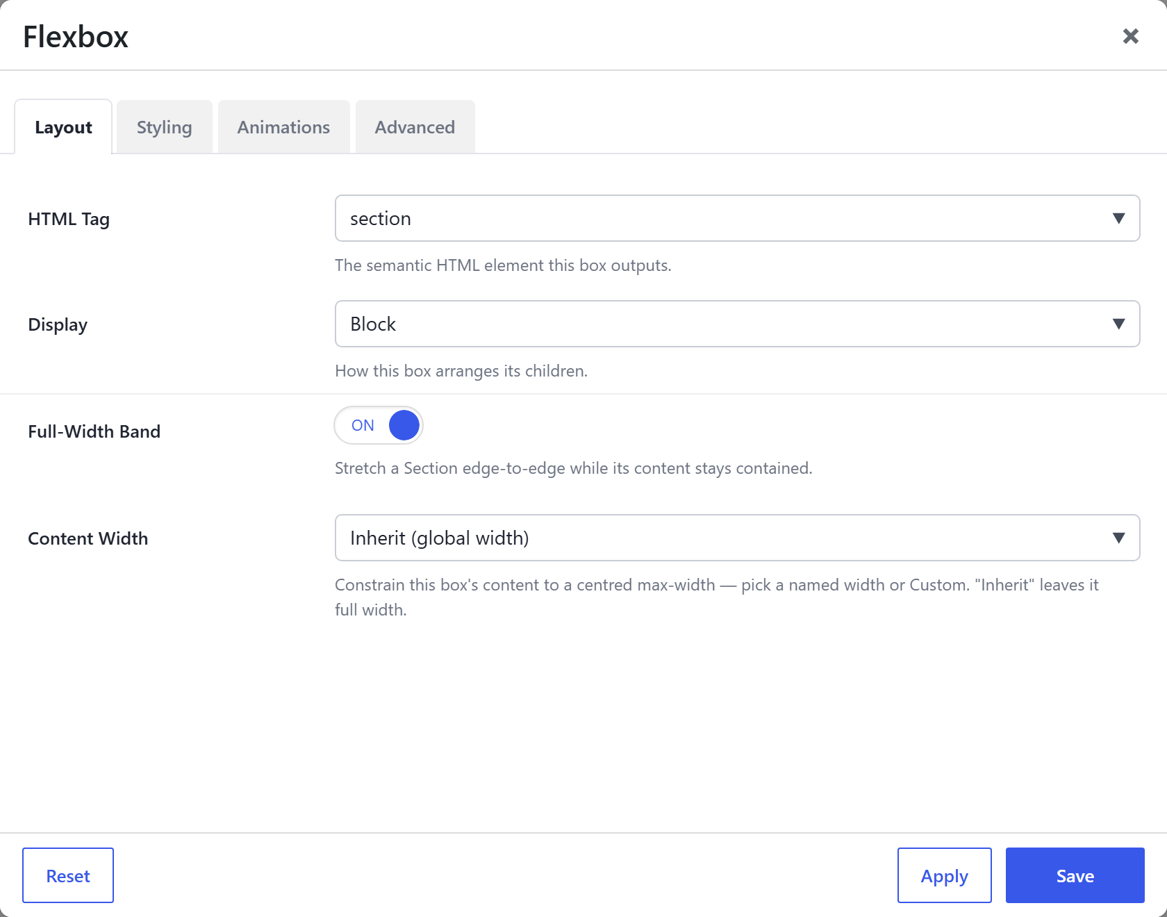
| Option | What it does |
|---|---|
HTML Tag (html_tag) | section for this tile (a titled content band). You can switch it to div / article / aside if you don't want a <section> landmark. |
Display (display) | Block (default), Flex or Grid — how the Section arranges its children. Choosing Flex reveals the Flexbox arrangement options; Grid reveals the Grid options. |
Full-Width Band (full_width) | Section only. On (default): the band (its background) spans the full window width while the content stays contained to the Content Width below — the classic full-bleed hero / colour-band. Off: the whole Section, background included, is contained to the site width. |
Content Width (content_width) | The centred max-width the contained content uses — a named width (Narrow / Medium / Wide / …, from Theme Settings → Components → Container Widths) or a Custom value. Inherit = the site container width. |
Responsive Collapse (responsive_collapse) | When the Section is Flex/Grid, auto-stacks its columns down on tablets/phones (on by default). |
If you set Display = Flex or Grid, the Section also gets the arrangement options (Direction / Wrap / Gap / Justify / Align, or Grid Columns / Auto-fit) — see the Flexbox and Grid pages.
Styling — band-only extras
These appear only when the HTML Tag is section, in addition to the shared styling options:
| Option | What it does |
|---|---|
Background Pattern (background_pattern) | Overlay a decorative SVG pattern (dots, grid, waves…) above the background layers. Manage the set in Theme Settings → Components → Background Patterns. |
Section Variant (variant) | Apply a named section style (Alt / Light / Dark …) that themes the background and text colours together, via a section--<slug> class. Manage in Theme Settings → Components → Section Styles. |
Top Shape Divider (divider_top) | An angled or curved SVG shape on the section's top edge. |
Bottom Shape Divider (divider_bottom) | The same on the bottom edge. |
Text Alignment (text_align) | Horizontal alignment of the text inside the band. |
Also on every tile
The Section shares the full Div option set — see Flexbox (Div) → Options every tile shares for details:
- Background (color / gradient / image / video), Border / Box Style, Backdrop Blur, Min Height, Aspect Ratio, Blend Mode, Clip Shape, Edge Fade, Margin & Padding.
- Child placement (how the Section sits in its own parent, if nested): Width Override, Grow to Fill, Prevent Shrinking, Flex Basis, Min Width, Align Self, Order, Grid Column Start.
- Animations and Advanced (CSS ID / class / custom CSS / visibility / dynamic content).