Box Presets
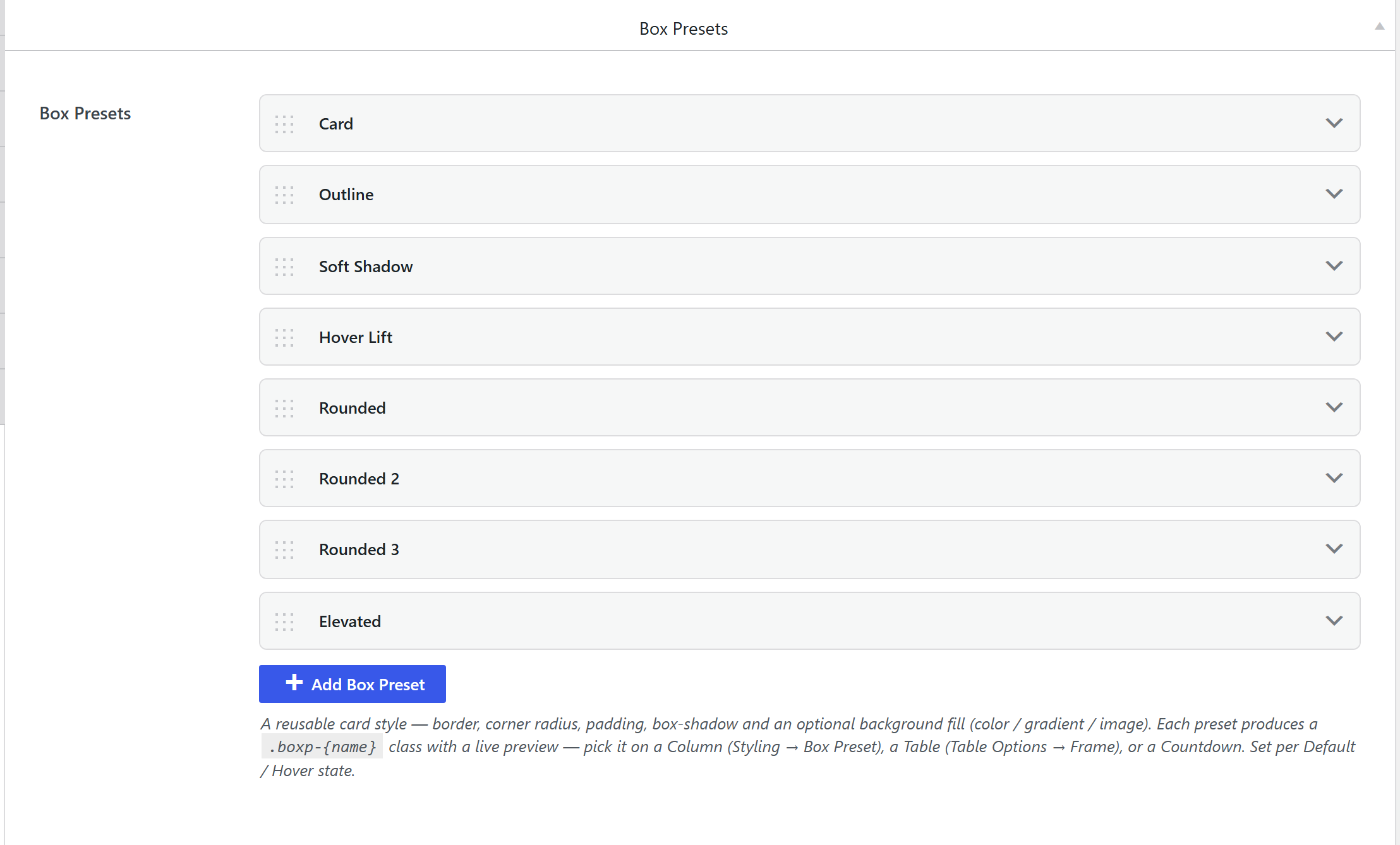
Theme Settings → Components → Box Presets is a library of reusable card skins: a border, corner radius, padding, box-shadow and an optional background fill (color / gradient / image), each with a Default and Hover state. You pick one on a Column (Styling → Box Preset), a Table (Frame), a Countdown, and similar.
How it's coded
Stored under the key border_presets, a border-presets
option (components-box.php). Each preset has an id, a name, and Default / Hover state groups holding
the border, radius, padding, shadow and background-fill fields. Colors reference your
Color Presets.
The output CSS
unysonplus_build_presets_css_string() (framework/includes/css-tokens.php) emits a base rule and a
hover diff per preset, keyed by a name-derived slug:
.boxp-{slug} { /* radius + transition + the Default state: border, padding, shadow, background… */ }
.boxp-{slug}:hover { /* only the props that change on hover */ }
Per-preset Custom CSS is supported too: a {{SELECTOR}} token in the preset's custom CSS is
replaced with .boxp-{slug} so you can target the exact card.
Where the output lives
Compiled into the single cached wp-content/uploads/unysonplus/css/presets-{hash}.css, enqueued as
unysonplus-presets (front end + wp-admin), inline <style> fallback. See the
shared pipeline.
How it's picked
A Column's Box Preset control is a preview picker of every .boxp-{slug}; the element renders the
class on its inner card wrapper (e.g. a column's .boxp-{name} inner div). Because only the class is
stored, editing the preset restyles every card using it.
Related
- Components overview — the shared pipeline.
- Color Presets — the colors a box preset references.