Buttons
Theme Settings → Components → Buttons holds three sub-libraries that together define every button
skin on the site: Button Presets (the color/skin), Sizes (the dimensions), and Hover
Animations (custom hover CSS). A button combines one of each, e.g. class="btn btn-primary btn-lg".
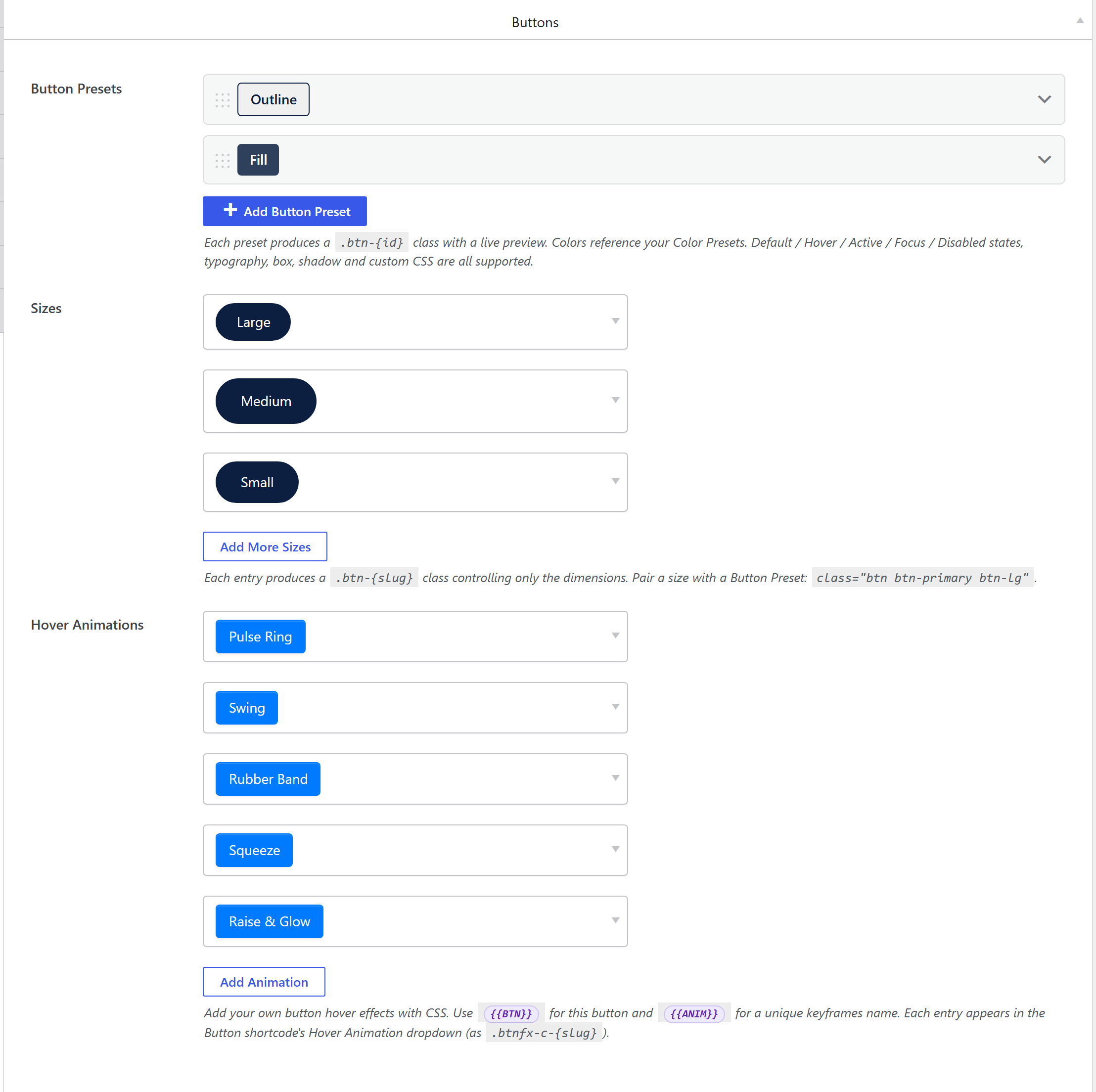
1. Button Presets — the skin
button_colors, a button-presets option
(components-buttons.php). Each preset produces a .btn-{slug} class with a live preview, and its
colors reference your Color Presets (so a re-brand flows through). Each
preset supports full Default / Hover / Active / Focus / Disabled states, plus typography, box,
shadow, transition, and custom CSS.
The slug comes from the preset name via unysonplus_button_preset_slug_map() (so Primary →
btn-primary, reusing the stock Bootstrap class name).
Output CSS
unysonplus_build_presets_css_string() (framework/includes/css-tokens.php) emits a base rule plus a
diff rule per interaction state, plus an outline variant:
.btn-{slug} { /* font + transition + the Default state (bg, color, border, radius, shadow…) */ }
.btn-{slug}:hover { /* only the props that change in Hover */ }
.btn-{slug}:active { … }
.btn-{slug}:focus { … }
.btn-{slug}:disabled, .btn-{slug}.disabled { … }
.btn-outline-{slug} { color:{c}; background-color:transparent; border-color:{c}; }
.btn-outline-{slug}:hover { … }
!importantButton preset rules use a plain .btn-{slug} selector (specificity 0,1,0) with no !important.
They win by specificity because the button extension wraps its stock .btn-* skins in :where()
(specificity 0), so a preset — or a child theme's own .btn-primary { … } — always beats the stock
skin regardless of CSS load order. This avoids an !important arms race that would make presets
un-overridable.
2. Sizes — the dimensions
button_sizes, an addable-box. Each entry produces a
.btn-{slug} class controlling only dimensions: font_size, line_height, padding_y,
padding_x, border_radius, and optional min_width / max_width. The Slug field is the class
suffix (sm → .btn-sm). Pair a size with a preset: btn btn-primary btn-lg.
3. Hover Animations
button_animations, an addable-box of name + raw CSS
(a code-editor). Selected via the
button-hover-animation picker on a button.
Where the output lives
All three sub-libraries compile into the single cached
wp-content/uploads/unysonplus/css/presets-{hash}.css, enqueued as unysonplus-presets (front end +
wp-admin), inline <style> fallback. See the
shared pipeline.
How it's picked
A button element's Preset control is the
button-style-picker (live preview of every
.btn-{slug}); the Size and Hover Animation are their own dropdowns. The element outputs
class="btn btn-{preset} btn-{size}".
Related
button-presets·button-style-picker·button-hover-animation- Color Presets — the colors buttons reference.
- Components overview — the shared pipeline.