Color Presets
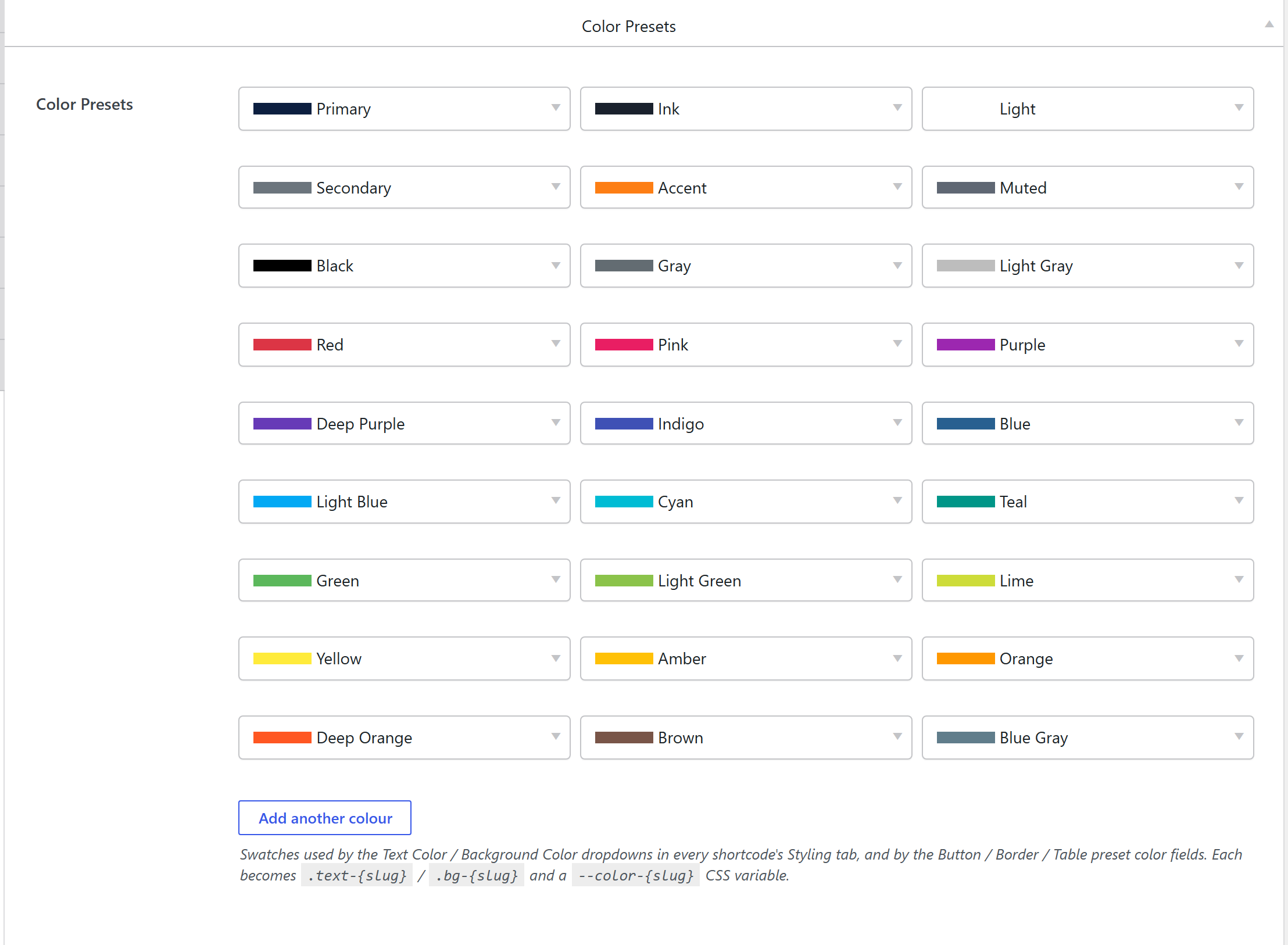
Theme Settings → Components → Color Presets is the site palette: a reusable list of named colors. Every color dropdown across the framework (a shortcode's Text Color / Background Color, a button / border / table preset's color fields) picks from this list, and each color becomes a CSS variable plus a pair of utility classes. Recolor a preset and everything that references it updates.
How it's coded
The library is an addable-box option named
theme_colors, defined in
framework/extensions/shortcodes/includes/theme-settings/components-color.php:
$options = array(
	'theme_colors' => array(
		'label'         => __( 'Color Presets', 'fw' ),
		'type'          => 'addable-box',
		'value'         => unysonplus_default_color_presets(), // the starter palette
		'sortable'      => true,
		'box-duplicate' => true,
		// each row = a name + a color
		'box-options'   => array(
			'name'  => array( 'label' => __( 'Color', 'fw' ), 'type' => 'text' ),
			'color' => array( 'label' => '', 'type' => 'color-picker' ),
		),
		// the collapsed-row preview (a swatch + the name)
		'template'      => '<span style="background-color:{{- color}};width:50px;height:10px;display:inline-block"></span> {{- name }}',
	),
);
So each saved row is simply { name, color }, and the whole array is stored in the Theme Settings
option theme_colors.
The output CSS
On every request, unysonplus_build_presets_css_string()
(framework/includes/css-tokens.php) walks theme_colors and, for each row, derives a slug from
the name (lowercase, non-alphanumerics collapsed to -) and emits three things:
:root { --color-{slug}: {hex}; }
:root .text-{slug} { color: var(--color-{slug}) !important; }
:root .bg-{slug}   { background-color: var(--color-{slug}) !important; }
For a row named Primary with #0d6efd:
:root { --color-primary: #0d6efd; }
:root .text-primary { color: var(--color-primary) !important; }
:root .bg-primary   { background-color: var(--color-primary) !important; }
Notes on the exact shape:
- The
:rootprefix +!importantare deliberate — they give the preset utilities enough specificity to reliably beat Bootstrap's own.text-*/.bg-*utilities and component CSS. Primaryis special: its slugprimaryalso drives the stock.btn-primaryskin and is the brand's--color-primary, so the Buttons/Box presets that referenceprimaryadopt the brand color.- Slug collisions (two rows slugging to the same value) — the first wins.
Where the output lives
That CSS isn't inline per element. The whole compiled token sheet is written once to a hashed file in uploads:
wp-content/uploads/unysonplus/css/presets-{hash}.css
- The
{hash}comes from the presets' content, so the URL is immutable/cacheable, and editing a color writes a new file (oldpresets-*.cssare auto-deleted). - It's enqueued as the
unysonplus-presetsstylesheet on both the front end and wp-admin (priority 35), so swatches render the same in the builder. - If uploads isn't writable, it falls back to an inline
<style id="unysonplus-presets">inwp_head.
See Components — the shared pipeline for the full generation flow.
How a color is stored on an element
When you pick a color on an element, the compact color control stores a small array — the preset slug wins, with an optional custom hex override:
// sc_color_field_compact value shape
array( 'predefined' => 'text-primary', 'custom' => '' )   // a preset
array( 'predefined' => '',             'custom' => '#ff9900' ) // a one-off custom color
At render time sc_color_to_css()
(framework/extensions/shortcodes/includes/shortcode-styling-helper.php) resolves that value:
- a preset (
predefinedliketext-primary/bg-blue) →var(--color-{slug}), so it tracks the palette live, or - a custom hex → that literal color.
$color = sc_color_to_css( $atts['title_color'] ); // e.g. 'var(--color-primary)'
Storing the slug (not the hex) is what lets a re-brand flow everywhere at once.
Default palette
unysonplus_default_color_presets() seeds the starter rows: Primary, Secondary, Accent, Muted,
Black, White, Gray, Red, Green, Orange, plus Light Gray, Pink, Purple, Deep Purple, Indigo, Blue,
Light Blue, Cyan, Teal, Light Green, Lime, Yellow, Amber, Deep Orange, Brown, and Blue Gray.
Re-brand in code
Read the defaults, change a row (usually Primary), and write the whole array back — the next
request regenerates presets-{hash}.css:
$presets = unysonplus_default_color_presets();
foreach ( $presets as &$p ) {
	if ( $p['name'] === 'Primary' ) { $p['color'] = '#f97316'; }
}
fw_set_db_settings_option( 'theme_colors', $presets ); // --color-primary + btn-primary go orange
Related
- Colors (Theme Settings tab) — the user-facing overview.
- Components overview — the shared preset pipeline.
color-picker·predefined-colors— the underlying controls.