Element Designs
Theme Settings → Components → Element Designs is the manager for design packs — the layout
variants an element offers in its Design option (the same picker where you choose, say, a Team
Member card layout). Unlike the other Components tabs, this isn't an addable-box preset library; it's
a management dashboard for installed packs.
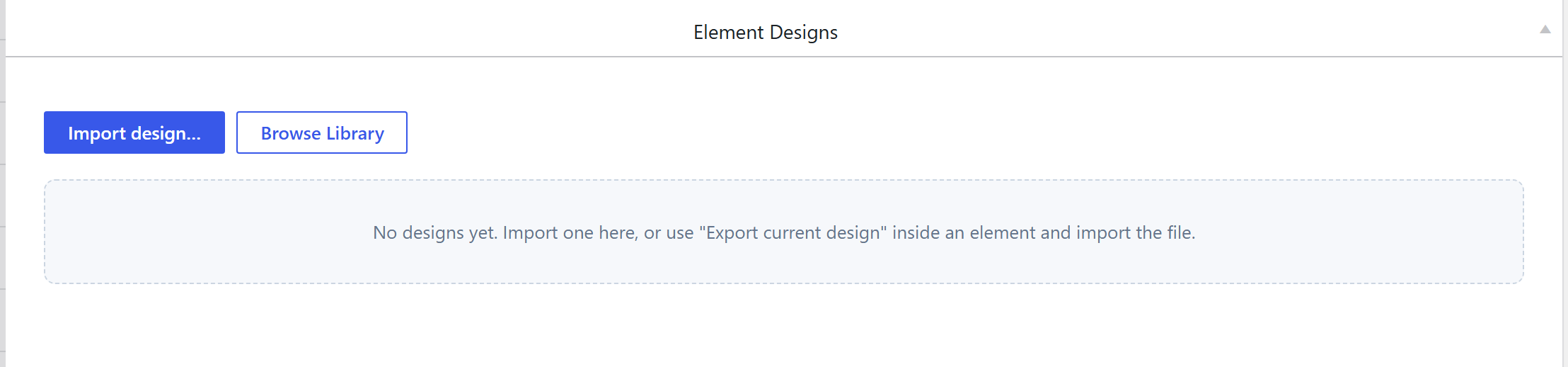
How it's coded
The tab is a bespoke UI: a single sc_eldesigns_manager option of type
html-full (a full-width custom HTML/CSS/JS control), not a
postbox-wrapped option group. It lists the design packs installed for each element, and lets you
install / remove / manage them.
What a design pack is (and its output)
A design is a self-contained folder an element loads for one Design choice — it ships its own
manifest.json, view.php (the render partial), scoped static/css/styles.css, optional
static/js/script.js, extra options.php, and an img/icon.svg picker tile. So a design's "output"
is its own scoped CSS/markup, not a class in the shared presets-{hash}.css — each pack styles its
own variant.
Building one is documented in Create a shortcode design (design pack).
How it's picked
On the element itself: the Design option (an image-picker of the installed packs' icon.svg
tiles). This Components tab is where packs are installed and managed; the element's Design dropdown is
where one is chosen.
Related
- Create a shortcode design (design pack) — build your own.
- Components overview