Icon Badges
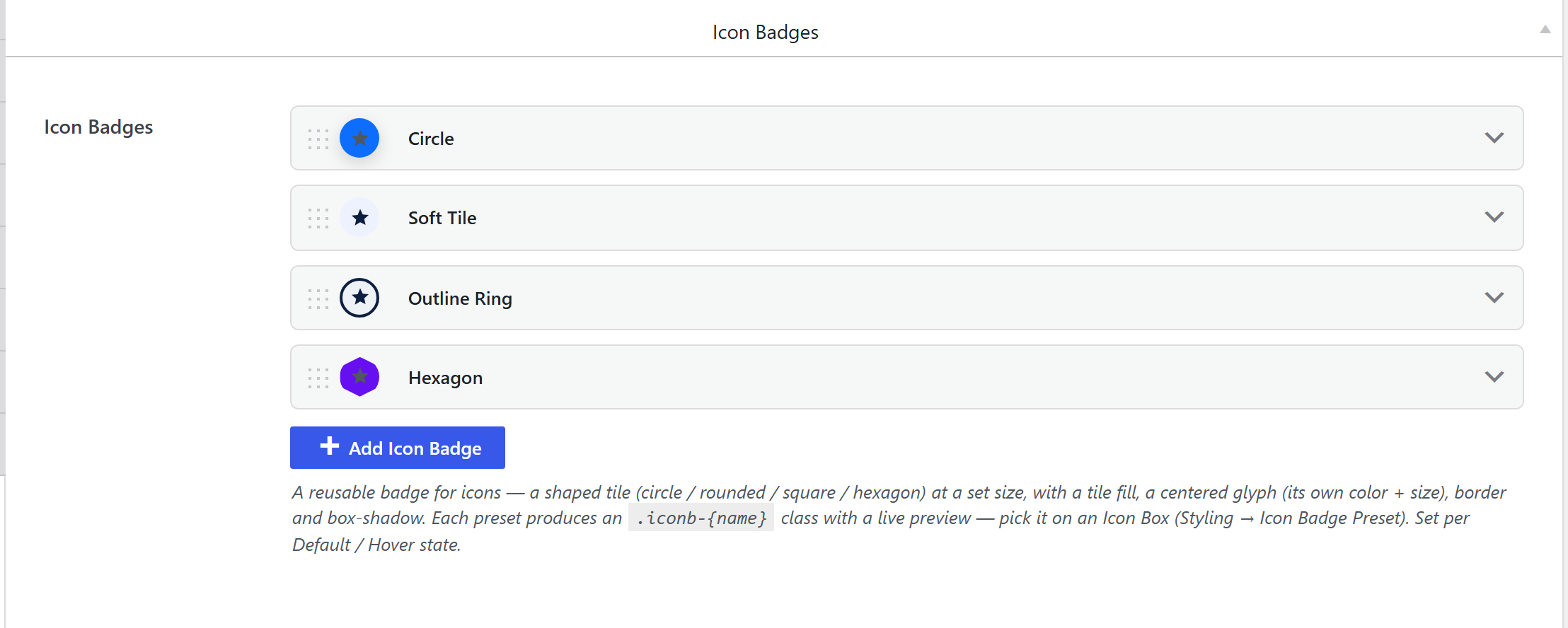
Theme Settings → Components → Icon Badges is a library of reusable icon badge tiles — a shaped
tile (circle / rounded / square / hexagon) at a set size, with a tile fill, a centered glyph (its own
color + size), a border and a box-shadow. Each preset produces a .iconb-{slug} class you pick on
an Icon Box (Styling → Icon Badge Preset), with Default and Hover states.
How it's coded
Stored under icon_badge_presets, an
icon-badge-presets-style option
(components-icon-badges.php). Each preset carries the tile shape, size, fill, glyph color/size,
border and shadow, per Default / Hover.
The output CSS
unysonplus_build_presets_css_string() (framework/includes/css-tokens.php) emits an inline-flex tile
rule per preset (so the glyph centers), sizing the tile via the badge size and the glyph via the icon
size (for both a font glyph and an inline SVG):
.iconb-{slug} { display:inline-flex !important; align-items:center; justify-content:center;
  width:{size}; height:{size}; /* shape radius, fill, border, shadow */ }
.iconb-{slug} svg, .iconb-{slug} .icon { /* glyph color + size */ }
.iconb-{slug}:hover { /* hover-state diffs */ }
Written to the shared cached presets-{hash}.css — see the
shared pipeline.
How it's picked
An Icon Box's Icon Badge Preset control (sc_icon_badge_preset_field) lists every .iconb-{slug};
the element wraps its icon in the badge class.