Image Styles
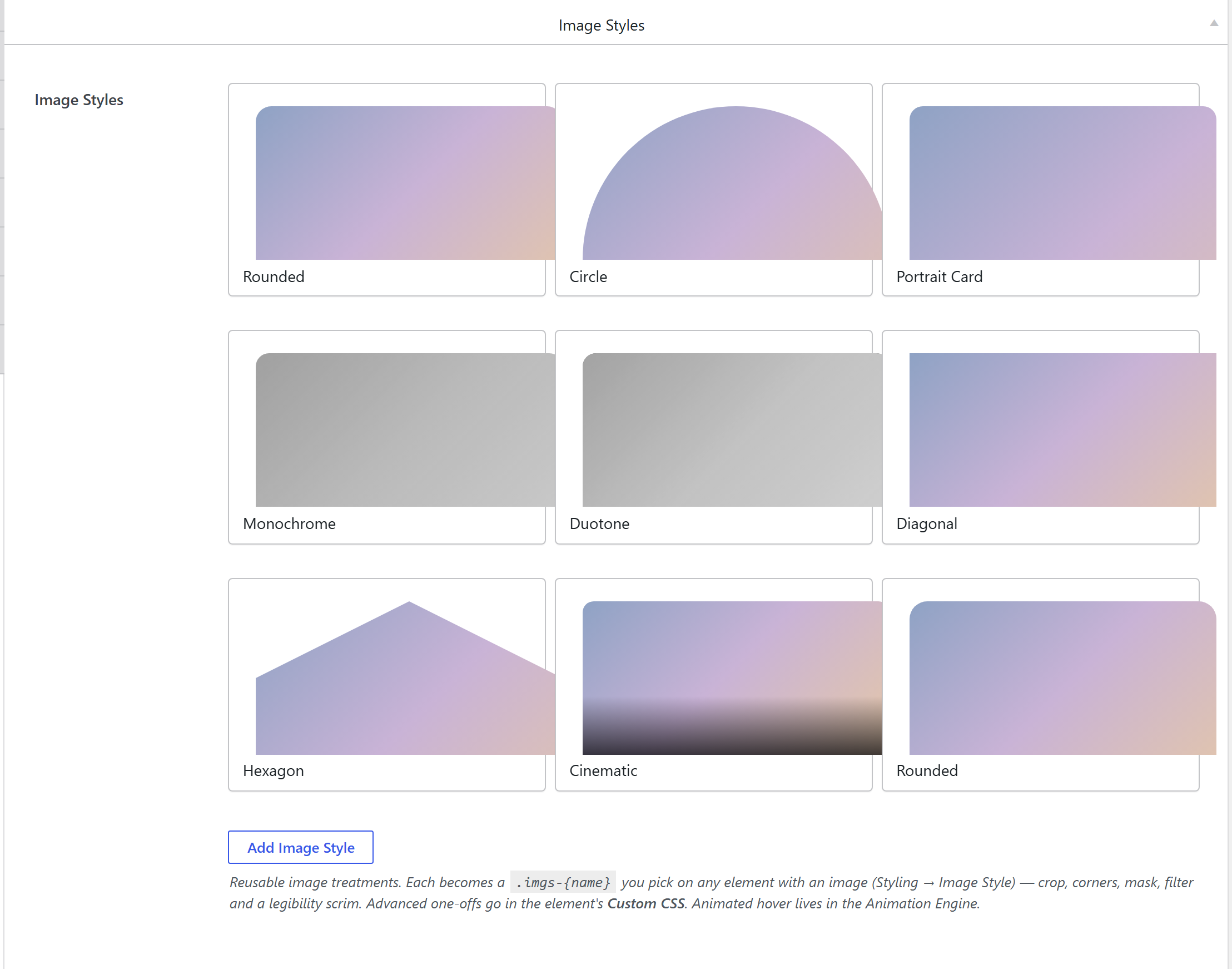
Theme Settings → Components → Image Styles is a library of reusable image treatments: an aspect crop, corner radius / circle, a clip or SVG mask (arch, blob, hexagon, custom), CSS filters (including a blend-mode duotone tint), and a legibility scrim. You pick one on any element with an image (Styling → Image Style) — galleries, image boxes, post cards, and so on. Defining a mask once applies it consistently everywhere (this replaced the old per-element Image Mask option).
How it's coded
Stored under image_styles, an addable-box
(components-image-styles.php). Each row is a style_name plus the treatment fields (aspect, radius,
shape/mask, filter, duotone color, scrim + scrim color). The collapsed row renders a live, isolated
<iframe> thumbnail (CSP-safe) approximating the treatment.
The output CSS — a token bundle + one shared base
This library uses an elegant pattern: instead of a full rule per preset, each preset emits only a
bundle of CSS variables on its .imgs-{slug} class, and a single shared .imgs-wrap base rule
consumes those variables. So the per-preset CSS stays tiny.
Per preset (framework/includes/css-tokens.php):
.imgs-{slug} {
  --imgs-aspect: 4/3;                 /* crop */
  --imgs-radius: 12px;                /* corners (or 50% for a circle) */
  --imgs-filter: grayscale(1) contrast(1.1);
  --imgs-clip: none;                  /* clip-path shapes */
  --imgs-mask: url(#…);               /* SVG masks (arch / blob / custom) */
  --imgs-duo: #21c45d;                /* duotone tint (mix-blend-mode:color) */
  --imgs-scrim: linear-gradient(...); /* legibility gradient */
}
The shared base (emitted once) wires those tokens onto the image and its wrapper:
.imgs-wrap { position:relative; display:block; isolation:isolate;
  overflow:var(--imgs-overflow,visible); border-radius:var(--imgs-radius,0) }
.imgs-wrap > img, .imgs-wrap img {
  width:100%; height:auto; aspect-ratio:var(--imgs-aspect,auto); object-fit:cover;
  border-radius:var(--imgs-radius,0); filter:var(--imgs-filter,none);
  clip-path:var(--imgs-clip,none); mask-image:var(--imgs-mask,none); /* +webkit */ }
.imgs-wrap::before { /* duotone */ background:var(--imgs-duo,transparent); mix-blend-mode:color }
.imgs-wrap::after  { /* scrim */    background:var(--imgs-scrim,transparent) }
So an element outputs class="imgs-wrap imgs-{slug}" around its <img>, and the base rule renders the
treatment from the preset's variables.
Where the output lives
Compiled into the single cached wp-content/uploads/unysonplus/css/presets-{hash}.css, enqueued as
unysonplus-presets (front end + wp-admin), inline <style> fallback. See the
shared pipeline.
How it's picked
The Styling tab's Image Style control is the
image-style-picker (a live swatch preview of every
.imgs-{slug}). Advanced one-offs go in the element's own Custom CSS; animated hover treatments live in
the Animation Engine.
Related
image-style-picker— the picker control.- Components overview — the shared pipeline.