Section Styles
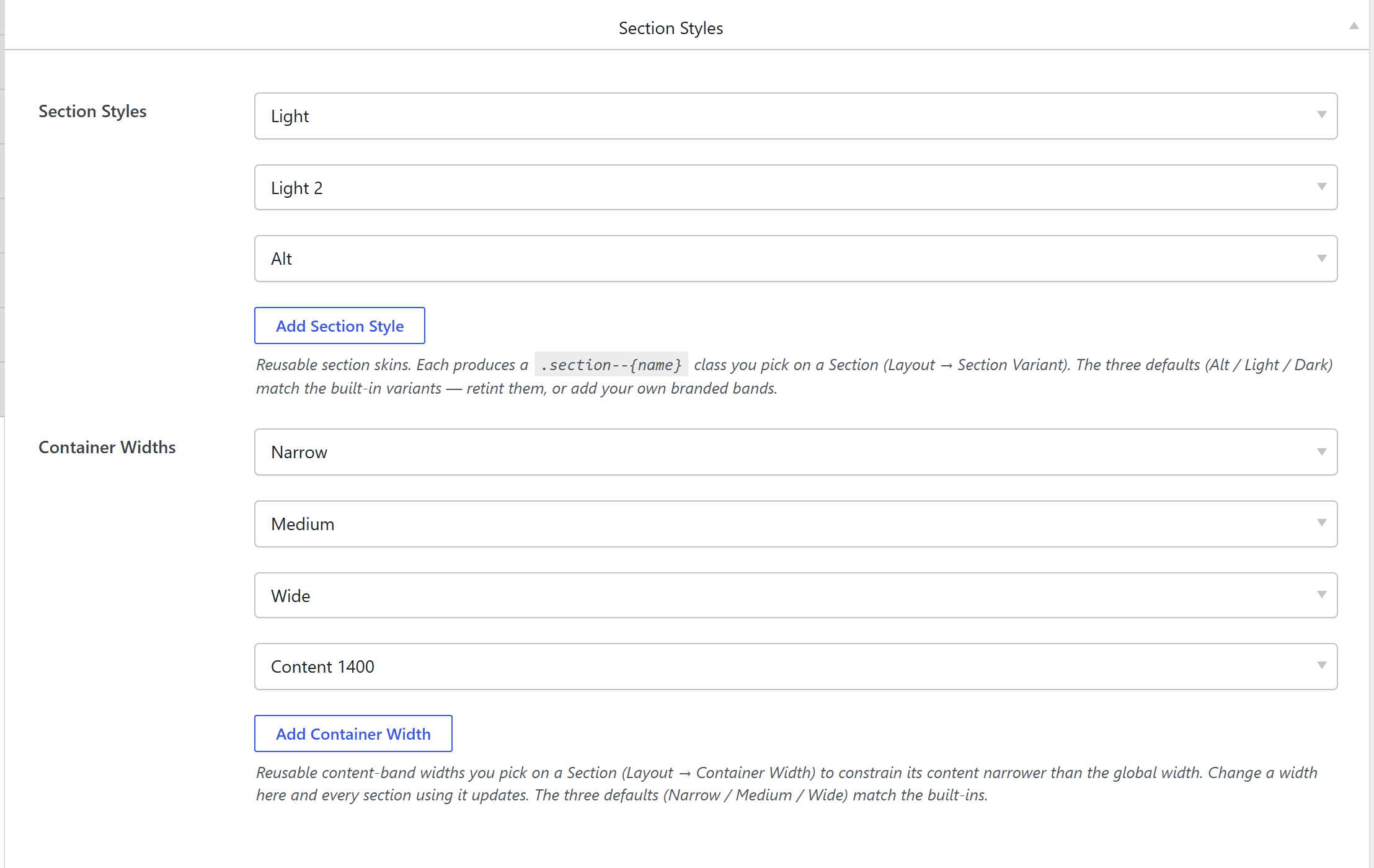
Theme Settings → Components → Section Styles is a library of reusable section skins (banded
backgrounds + text/heading/link colors). Each produces a .section--{slug} class you pick on a
Section via Layout → Section Variant. The three defaults — Alt / Light / Dark — match the
built-in variants; retint them or add your own branded bands.
How it's coded
An addable-box stored under section_style_presets
(components-section-styles.php). Each row has a Name (the class suffix and dropdown label, e.g.
Dark → .section--dark) plus the skin fields (background, text/heading/link colors, border…). This
tab also hosts the Container Widths library used by a Section's per-section width preset.
The output CSS
Compiled by unysonplus_build_presets_css_string() into a .section--{slug} rule (background + the
section's text/heading/link colors), written to the shared cached
presets-{hash}.css. See the shared pipeline.
How it's picked
A Section's Section Variant dropdown lists every .section--{slug}; the element renders the class
on the <section>. Because it stores the slug, editing the preset restyles every section using it.