Spacing
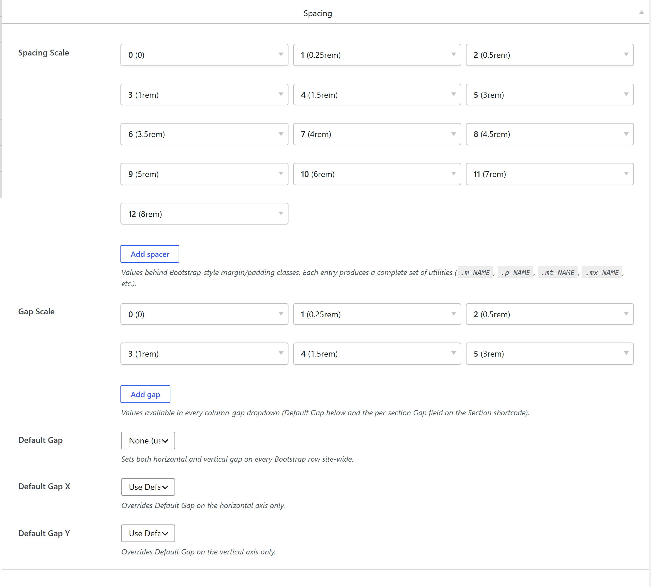
Theme Settings → Components → Spacing + Gap defines the values behind the margin / padding utilities. Each entry in the scale produces a complete set of Bootstrap-style classes, so the whole site's spacing rhythm is editable in one place and every element's Spacing control offers the same named steps.
How it's coded
An addable-box stored under spacing_scale
(components-spacing.php), plus a gap_scale group for flex/grid gaps. Each row:
- Name — the slot suffix (e.g.
3→.m-3/.p-3). Avoid Bootstrap-reserved names (sm md lg xl xxl n1–n5 auto). - Value — any CSS length:
0.5rem,8px,calc(1rem + 2px)…
The output CSS
For each entry, unysonplus_build_presets_css_string() emits the full family of margin and padding
utilities — all-sides, per-axis and per-side:
.m-{name}  { margin: {value}; }
.p-{name}  { padding: {value}; }
.mt-{name} { margin-top: {value}; }  .mx-{name} { margin-left: {value}; margin-right: {value}; }
/* …mb / ms / me / my, and the p* equivalents */
The presets stylesheet loads after Bootstrap, so these values override the framework defaults.
Written to the shared cached presets-{hash}.css — see the
shared pipeline.
How it's picked
Every element's Spacing control (the spacing option type)
offers the named steps; the element renders .m{side}-{name} / .p{side}-{name} classes.
Related
spacingoption type · Components overview