Text Styles
Theme Settings → Components → Text Styles is a library of named typographic tokens. A Text Style is a size plus optional weight, line-height, letter-spacing and transform — every field is opt-in, so a style only emits the properties you fill in and any blank one inherits from the element's own tag. (A blank weight keeps the heading's weight; it does not thin it.)
They're offered by the Text Style dropdown in a shortcode's Styling tab (and by controls like a Special Heading's Subtitle Text Style).
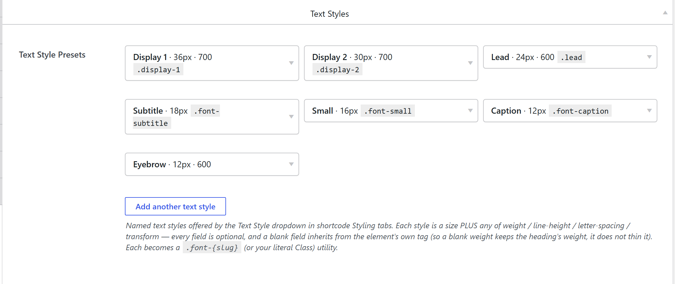
How it's coded
An addable-box stored under the (legacy) key
font_sizes, defined in components-typography.php. Each row:
'box-options' => array(
	'name'           => array( 'type' => 'text' ),   // → .font-{slug}
	'size'           => array( 'type' => 'text' ),   // px, no unit; optional
	'weight'         => array( 'type' => 'select' ), // 300–900, or Inherit
	'line_height'    => array( 'type' => 'text' ),   // unitless or a length
	'letter_spacing' => array( 'type' => 'text' ),   // bare number = em
	'transform'      => array( 'type' => 'select' ), // none/uppercase/lowercase/capitalize
	'class'          => array( 'type' => 'text' ),   // optional literal class override
),
The Class field is the escape hatch: fill it (e.g. display-1) and the style targets that literal
class — handy to override a Bootstrap class. Blank → the class is auto-derived as .font-{slug} from
the name.
The output CSS
unysonplus_build_presets_css_string() (framework/includes/css-tokens.php) emits only the filled
properties, scoped to the style's own selector:
:root { --font-size-{slug}: {size}px; }
:root .font-{slug} {
  font-size: var(--font-size-{slug}) !important; /* only if Size is set */
  font-weight: 700;          /* only if Weight is set */
  line-height: 1.1;          /* only if set */
  letter-spacing: -0.02em;   /* a bare number is read as em */
  text-transform: uppercase; /* whitelisted keyword */
}
Why the mixed use of !important:
- Size keeps a
--font-size-{slug}token +!importantso it also feeds mobile auto-scaling and beats Bootstrap / component utilities. - Weight / line-height / letter-spacing / transform carry no
!important— the:root .font-…selector (specificity 0,2,0) already outranks Bootstrap's.display-N(0,1,0) and the tag-token weight rule, while an element's own Custom CSS can still win. - Blank field ⇒ not emitted ⇒ inherits the element's tag token.
letter_spacing normalizes a bare number to em (so -0.02 → -0.02em); a value with its own unit
passes through.
Where the output lives
Same as every Components library: compiled into the single cached
wp-content/uploads/unysonplus/css/presets-{hash}.css and enqueued as unysonplus-presets
(front end + wp-admin), with an inline <style> fallback. See the
shared pipeline.
How it's picked on an element
The Styling tab's Text Style control (sc_font_size_field, stored as font_size_preset) holds the
style's slug; the element renders the matching .font-{slug} class on the text. Because only the
class name is stored, editing the preset reflows everywhere it's used.
Related
- Typography (Theme Settings tab) — fonts + the base scale.
- Components overview — the shared pipeline.